Ranking the 2026 NWSL Kits
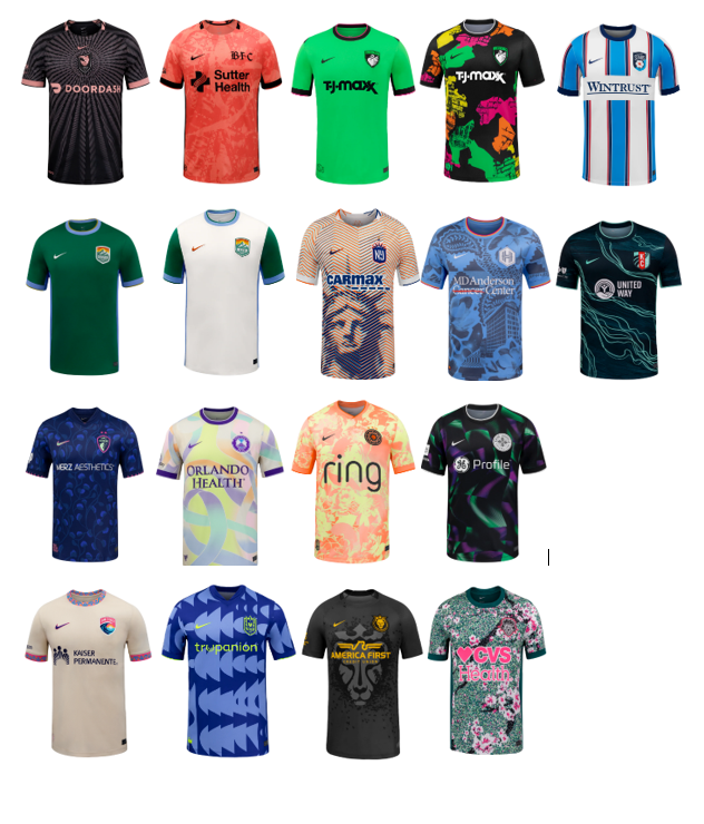
All kit photos are courtesy of the nwslshop.com
It’s time again for my (or our, since Elizabeth has equal voting rights, except when I overrule her) annual kit ranking! I love kit release day, and this is one of my favorite pieces to write every year. The good news is that the kits seem to get better each season. The hilarious news is that every kit comes with a “corporate speak” description for the inspiration of the kit, and those vary highly in quality and length. Let’s just say that Denver already has a very high opinion of itself and takes its kit marketing WAY too seriously. I hate them even more now. Let’s dive in.
Utah
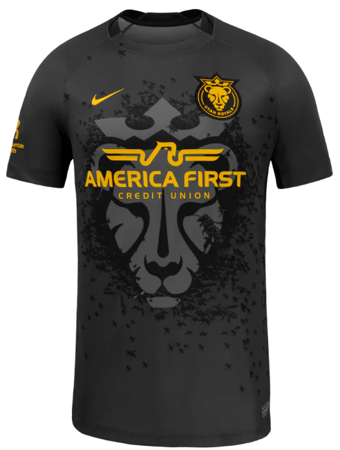
Ranking: 18
Michael’s comments:
I am starting off by immediately breaking my rules. No matter how Elizabeth ranks this one, I am putting it in dead last. It looks like something that an off-duty ICE agent might wear. Utah needs to get a sponsor with a better name.
Marketing Description from nwslshop.com:
“The Swarm Kit honors Utah’s identity as the Beehive State, with bees surrounding the lioness as a tribute to the state’s legacy of unity and hard work. The heavy black and tonal dark grey as the base is elevated with touches of Utah Royals Gold.
The Swarm symbolizes a simple truth: no single bee defines the hive. Success is built through collective effort. This kit connects the entire Royals ecosystem, from players and coaches to the stadium and every fan in the stands. At its core, the Swarm represents belonging. We are the swarm. We are better together.”
What a mess of hot garbage. Isn’t the point of a queen bee to “define the hive?”
Elizabeth’s comments:
I LOVE the lion watermark. I HATE that sponsor name and logo. If I worked in Marketing for the Utah Royals I would have spent my entire off-season trying to convince Skullcandy to become our jersey sponsor (HQ in Utah) or heck where’s Adobe (also in Utah) when you need them? Probably trying to convince someone to download a free version of Acrobat.
Denver (Primary)
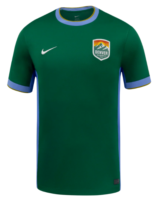
Ranking: 17
Michael’s comments:
I have repeatedly gone on record stating that I highly despise green kits, so I won’t go through the reasons again. I will always rank them low. The badge is cool. It’s boring otherwise.
Marketing Description from nwslshop.com:
“The Inaugural Evergreen kit, the first-ever, for Denver Summit FC, is more than a uniform, it’s a declaration of arrival and a love letter to the place we call home. Designed to honor Colorado’s untamed beauty and mark a historic first season, the Inaugural Evergreen kit captures the spirit of Coloradoans, the ruggedness of our community, and the ambition of a club ready for the first climb.” (It keeps going for a few paragraphs…)
I hope this team loses every match by at least 3 goals if this is the type of self-important drivel we can expect from such a mediocre production.
Elizabeth’s comments:
An entire jersey of the world’s worst color. This is actually the color that the refs should wear. They would blend right into the field, and everyone could just ignore them because they’re usually not doing anything useful anyway.
Washington
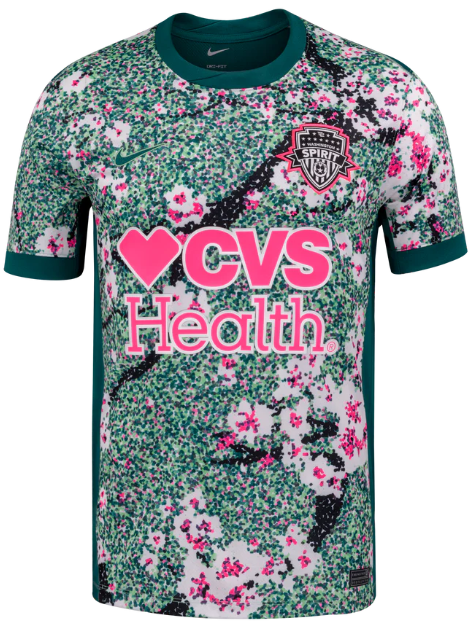
Ranking: 16
Michael’s comments:
Well, at least the Spirit is trying with its kits now. I liked the highlighter yellow one last season and I get what they were trying to do here, but it is just ugly as sin and also green.
Marketing Description from nwslshop.com:
“The Spirit in Bloom Kit features DC’s iconic cherry blossoms and a dark green Potomac River motif
This kit captures the blossoms drifting gracefully along the river while honoring the stunning backdrop of the Nation’s Capital”
This explanation seems factual and mercifully short, but doesn’t make me like the kit any better.
Elizabeth’s comments:
I initially loved this look (Trinity Rodman was modeling the heck out of it) but then I saw the back of the jersey and had a guttural reaction that I can only describe as negative. If you haven’t seen it, stop what you’re doing it and google it. I’ll wait. Back? Okay glad we’re on the same page now.
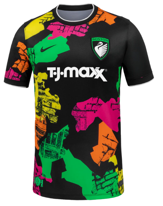
Boston (Primary)
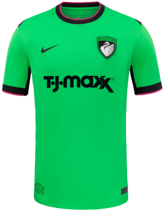
Ranking: 15
Michael’s comments:
The PRO referees will have one less jersey option this year it seems. This color is pretty much identical to the green kits they parade around in while being out of position to properly judge offside decisions. Why did both new teams go green? Do they hate colorblind people? It’s a better shade of green than Denver’s and Racing’s “Roots” kit but that is just about all this kit has going for it. Surely the designers could have come up with a more inspiring option by going through the racks at an actual TJ-Maxx.
Marketing Description from nwslshop.com:
“The First Light kit marks the beginning of Boston Legacy. Rendered entirely in Legacy green, it reflects the club’s lead color and sets the foundation for everything that follows. Simple, confident, and unambiguous, this kit establishes presence rather than telling a story. The name First Light nods to an opening season and a first step forward. The start of something new, defined not by what came before, but by what comes next. This is the kit that introduces Boston Legacy to the league, the city, and the future.”
They could have just said, “we picked Crayola green, so suck it, losers,” and saved everyone some time from reading that nonsense.
Elizabeth’s comments:
For some reason Michael really wanted to include the new Referee tops in our rankings this year so here goes. Oh? You say this is the new Boston team’s jersey? Are we sure about that? Okay, I mean, welcome to the league, I guess.
Portland
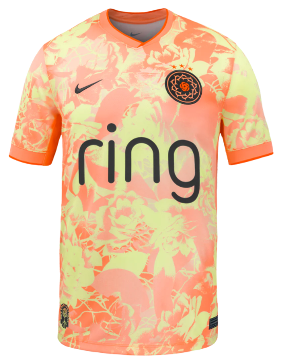
Ranking: 14
Michael’s comments:
Portland is old enough to know better, so why they keep coming up with dreadful kits is beyond me. Surely there has to be many better ways to do what they were trying to do with this kit. It’s pointlessly detailed for no apparent reason. They should get docked a star from their badge because this kit is so bad.
Marketing Description from nwslshop.com:
“The Portland Thorns Electric Bloom kit radiates the fearless brilliance of a club rooted in the creative energy of our Portland community.
Striking a harmonious balance of grit and grace, this kit features a bold pattern of atomic pink and voltage yellow roses. Electric red and mossy green accents nod to the club’s core brand colors and the moody forests of the Pacific Northwest.”
You can’t tell me that AI didn’t write or at least assist with that assessment. Atomic pink? Voltage yellow? Give me a break.
Elizabeth’s comments:
I’m getting mimosa vibes from this one but nope, they managed to sneak in some flowers on this one too. I would have ranked this higher, but that neck is cutting off the oxygen to my brain. Might as well have sewn a crown of thorns around the collar.
Kansas City
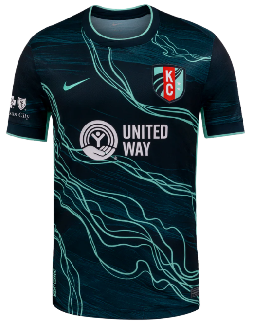
Ranking: 13
Michael’s comments:
I think we are firmly out of the “sartorial travesty” territory now. This kit and every one that follow has some redeeming qualities.
I could see how someone might really like this kit, but that someone isn’t me. Kansas City was probably due an average kit, so they got one.
Marketing Description from nwslshop.com:
“The Storm Kit represents the current that is rising, the bold pattern highlights the current that runs through Kansas City and represents the current rising for the 2026 season
The Storm colorway, drawn from the signature palette of the Kansas City Current, represents the team’s persistence and resilience, the storm is coming”
Also, so full of themselves, but with some evidence to back up their bravado. Paying attention, Denver? Worst of luck in 2026, Kansas City!
Elizabeth’s comments:
Is this a wave current or an electrical current? Probably don’t want to mix those too. While I love a good black-with-mint-accents look, I feel like this been done and someone really could’ve thought just a few minutes more about how to give this team the look that Brittany Mahomes deserves. (Ed: I dislike the Mahomes Family, so she probably deserves that Spirit monstrosity.)
Denver (Secondary)
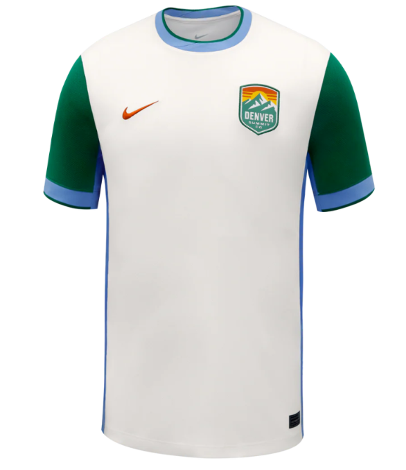
Ranking: 12
Michael’s comments:
I like a clean, sponsor free kit every now and then. This look isn’t half bad. I am sure the humble folks in Denver just wanted something simple…
Marketing Description from nwslshop.com:
“A tribute to the quiet power and beauty of a Colorado winter.
Inspired by fresh snowfall, capturing stillness, clarity, and cold-weather resilience.
Crisp alpine white base mirrors the snowcapped Rockies and seasonal flurries” (again, it keeps going.)
Holy $#*@, Denver. Have some self-awareness. This kit is alright, but the need to explain “white” boggles the mind. I hate this team. Did I mention that already?
Elizabeth’s comments:
Debut kit, huh? Low-key, colors on brand. A serious look. As much as I hate “evergreen” it would feel wrong to lean into the teal of the logo in the club’s first year, so I think it was well done. Welcome to the league, Denver Trees! Oh wait, it’s Denver Summit? Yeah, they should’ve gone with a different sleeve color.
Angel City
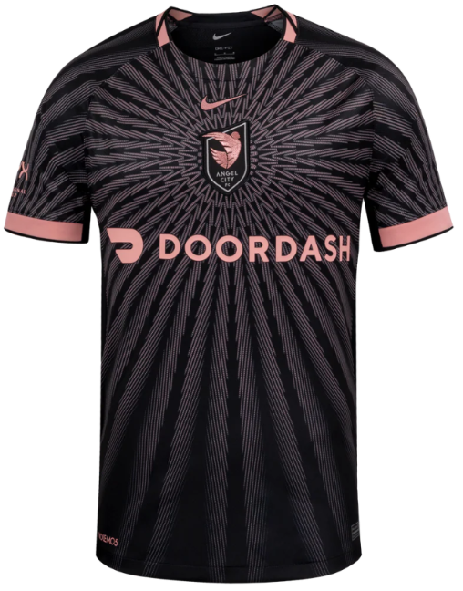
Ranking: 11
Michael’s comments:
I actually quite like this one, but that’s democracy for you. It doesn’t always work. Has anyone looked into that? Anyway, I like kits that you can look at and tell exactly who the team is without having to do too much thinking. It screams “Angel City”. I like Door Dash. Sometimes, it’s just that simple.
Marketing Description from nwslshop.com:
“The Flare kit celebrates the 5th season for Angel City and features a special center chest crest.
From soul to sol: A sol rosa sunburst pattern shine from the center”
Pretty straightforward. Let’s see what Elizabeth has to say for herself and her low ranking of this kit.
Elizabeth’s comments:
Ok serious question: are teams now going to have to display a may-cause-seizures warning before matches that feature Angel City? I guess that target visual is needed to draw attention to the logo that has drifted to the center of the chest. Can they even do that? Aren’t there federal laws about logo placement on jerseys?
Bay FC
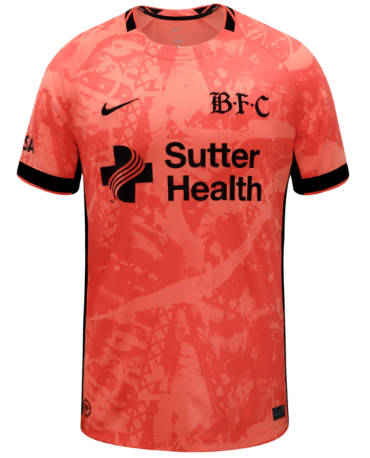
Ranking: 10
Michael’s comments:
I think this is Bay’s best kit to date, but it doesn’t have a whole lot of competition. The alternate logo is cool. I like the idea of embracing a secondary color on an alternate kit.
Marketing Description from nwslshop.com:
“Bay FC's Poppy Kit embodies the Bay Area's strength in connection and community.
The colorway leans into Bay FC's poppy color and is the first appearance of this color as a primary kit application in Bay FC history. The poppy color, as it appears on the kit, symbolizes the beauty and energy of the Bay Area, while the black accents represent our strength and boldness.”
I must be a simpleton, because all I could think of was “orange”.
Elizabeth’s comments:
Poppies are red, violets are blue, this jersey is orange and so underwhelming that I’m abandoning my poem in search of the real poppy red that B-F-C is claiming as their inspiration. And BTW who calls this team B-F-C? Is that a thing? How are we supposed to know that this isn’t the new Boston FC jersey? (Ed: you shouldn’t trust Elizabeth on color judgement. Her parents must have bought her Rose Art crayons instead of Crayola when she was little. Upon a little bit of research, the color “poppy” is definitely in the “red-orange” range.)
Boston (Secondary)
Ranking: 9
Michael’s comments:
Democracy at work again. Elizabeth liked it and I don’t particularly care for it, thus it ends up at 9. I definitely don’t dislike it. It was securely in my “not terrible range”. Let’s see if the marketing description helps.
Marketing Description from nwslshop.com:
“The Common Ground Kit is rooted in the neighborhoods surrounding White Stadium and the shared spaces that shape Boston.
The shapes represent Boston neighborhoods and the brick pattern represents the roads of Boston”
So, not really. I like Boston. Don’t sell past the “yes”. This kit is trying too hard.
Elizabeth’s comments:
Every time I look at this one I like it a little bit more. The 80s neon look is due back for a replay, and it never really took time off from graffiti, so I can get behind the brick design.
Chicago
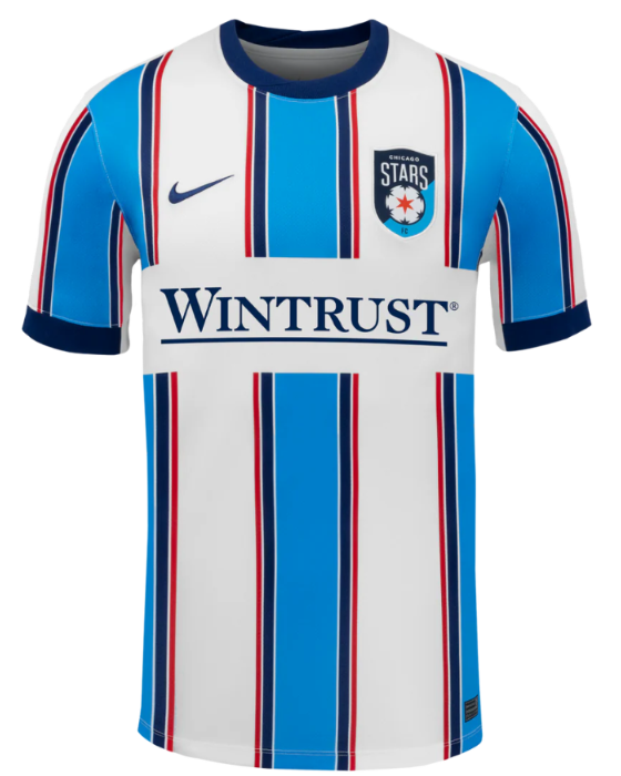
Ranking: 8
Michael’s comments:
I feel like this kit is daring me to hate it, but I don’t. It doesn’t look like any previous Stars kit, but you also know that it is a Stars kit without looking to closely. Well done, I guess.
Marketing Description from nwslshop.com:
“The 2026 Chicago DNA kit is rooted in the Stars’ iconic palette of blue, white, and red.
Drawing inspiration from the city’s most recognizable landmarks and fortitude, the design features a striking central stripe flanked by four supporting stripes of diminishing width.”
Okay…some of that makes sense, sorta.
Elizabeth’s comments:
Stars and stripes forever! I am incredibly proud to know this reference to a number by John Philip Sousa who I only know because of Captain Holt on “Brooklyn 99” (RIP Andre Braugher, I miss you every day) and that’s all I have to say about that.
Seattle
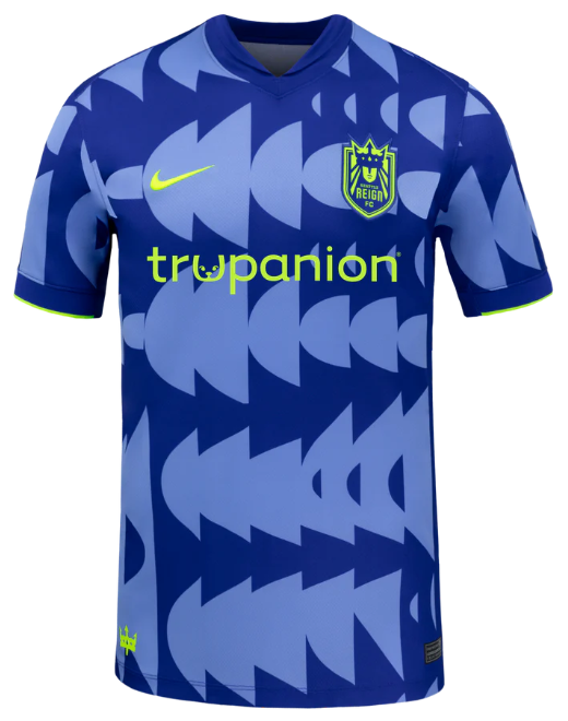
Ranking: 7
Michael’s comments:
This is one that I think could have been even better, but I still like it. As always, the queen of the badges does her fair bit of the heavy lifting here. The color contrasts are good, and I don’t quite know what is going on, but I don’t mind it. What say you, marketing department?
Marketing Description from nwslshop.com:
“The Surge Kit represents legacy in motion, a tribute to the foundation built over time and the next generation stepping forward to carry it on.
Deep Concord Blue anchors the kit in heritage, reflecting the history and identity that shaped this club. Royal Pulse signals the rising energy of what’s next. Volt ignites the point where past and future meet.”
That wasn’t particularly helpful, but whatever.
Elizabeth’s comments:
This looks like someone is trying to line up some images in Microsoft Word and Clippy is just not having it. Setting aside any OCD tendencies, the pattern is unique and fun, and I really cannot love that color scheme any more than I do.
Orlando
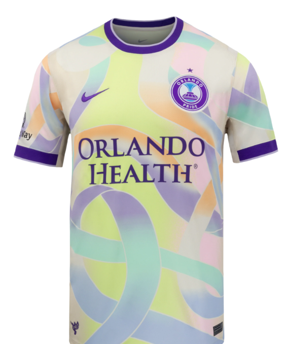
Ranking: 6
Michael’s comments:
Democracy fails us again. I moved this one up a spot regardless. I love this kit. It is my number one. Elizabeth has some lame excuse for not liking it that doesn’t make a lick of sense. For me, it is up there with the best NWSL kits of all time.
Marketing Description from nwslshop.com:
“The Orlando Pride 2026 Unity Kit commemorates the 10-year remembrance of the Pulse Nightclub tragedy, symbolizing the strength, resilience, and unity of the City of Orlando
The kit features interwoven ribbons of color coming together, representing the unbreakable bond and collective spirit of the Orlando community.”
As good of a reason as any to design a kit in a specific manor.
Elizabeth’s comments:
I swear this jersey already exists. Someone somewhere out there has worn this jersey to play a football match. Maybe it was in London. Or maybe it was an Upward soccer league, lower division for ages 3-5, but I’m telling you this jersey is not new. If there is nothing new under the sun (so says Solomon) then may I add into evidence this jersey. (Ed: I cannot for the like of me figure out what in the world she is talking about. I have shown her multiple kits that could possibly be close and none of them are the one she is thinking of. Maybe she will change her mind if she sees it in person or on tv.)
Houston
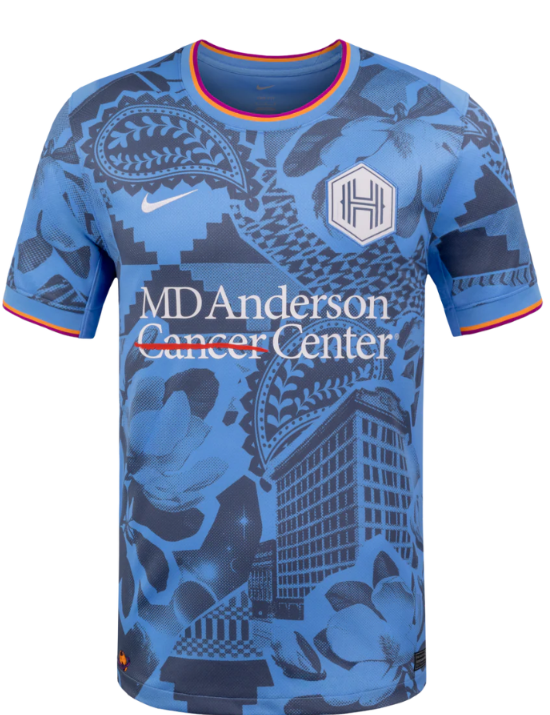
Ranking: 5
Michael’s comments:
We are now firmly in the “Michael and Elizabeth” agree territory. This kit accomplished what I think Portland and Bay were attempting to do, but with much better success. The contrasting blues work so much better. I did chuckle a little that the residents of Houston might have some sort of soft spot for such and anonymous building. The rest of it very cool.
Marketing Description from nwslshop.com:
“The Houston Chronicles kit highlights the diversity and culture of Houston while also showcasing the southern hospitality that welcomes all, this kit is a tapestry of what makes 'Houston' Houston.
This kit highlights five key elements: the original Houston Chronicle building calls out iconic Houston architecture; magnolia flowers representing Houston’s “Magnolia City”; a paisley cowboy motif inspired by classic bandanas; geometric textiles symbolizing the city’s diversity; and “Space City” representing NASA”
Somebody is going to have to explain to me what is so iconic about the original Houston Chronicle building. Did it transform into a robot or something. Looks like a pretty standard building to me.
Elizabeth’s comments:
This jersey had me at the giant paramecium on the top shoulder. What, you didn’t learn about paramecium and mitochondria in middle school biology? (The mitochondria is the powerhouses of the cell.) Or maybe you’re calling it paisley since it is a fashion print and not a science fair project, but you would be incorrect.
Gotham
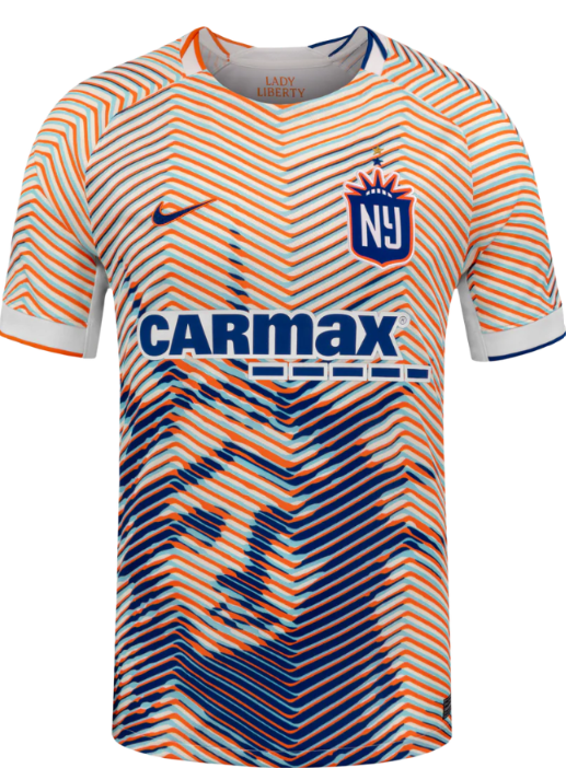
Ranking: 4
Michael’s comments:
I like the “Mets-ish” color scheme, and the orange around the badge is really working for me. The stacked stars are a nice touch too. My only complaint is that Lady Liberty is a tad bit too big. Having it stop fully below the logo might just look the tiniest bit better. I do have to poke fun at the used car lot sponsor, but hey…I have bought 2 cars from CarMax, so who am I to judge. Okay, I do have to be a little judgy. Doesn’t such a prominent Statue of Liberty remind you of a sketchy car lot or sketchier tax service, or the sketchiest of them all…Saul Goodman.
Marketing Description from nwslshop.com:
“Gotham FC introduces their first third kit, this kit features the blue and orange colors of the New York City flag and showcases the iconic Lady Liberty, creating a jersey that truly honors Gotham and its community.
Features a gold star, symbolizing the team’s status as the reigning NWSL Champion”
Yep, that sums it up.
Elizabeth’s comments:
The orange tiger stripes that fade into a navy gradient to reveal the statue of liberty is literally why third kits were created. And that extra star above their logo representing their current reign as champion is so spicy. Can’t wait to see my girl Jae Howell rocking this little number.
North Carolina
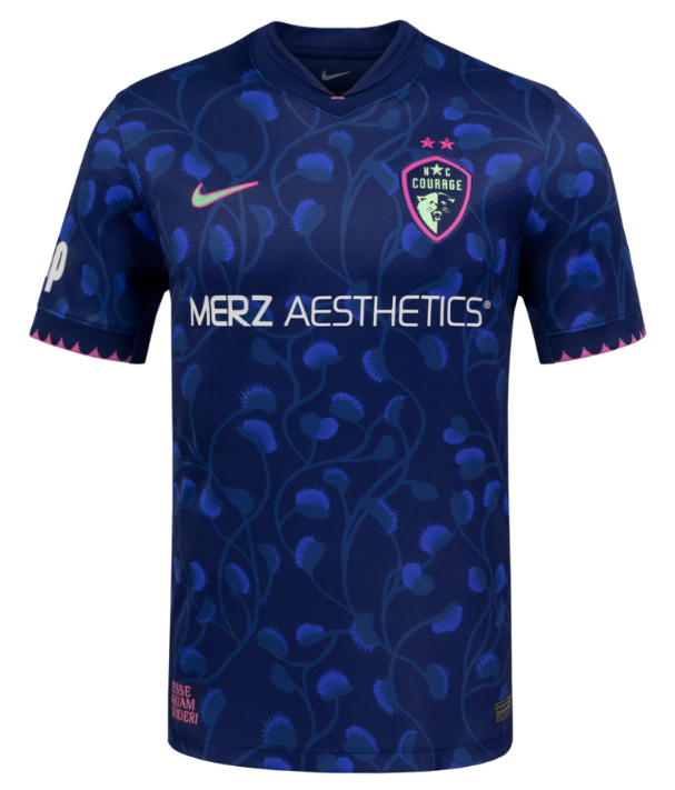
Ranking: 3
Michael’s comments:
I generally do not like saying anything good about North Carolina, but this is a fine kit. Hmmm…are those Venus flytraps?
Marketing Description from nwslshop.com:
“The “Become” Kit is the North Carolina Courage’s first third kit and completes the trifecta of the three defining words from our Place to Be manifesto: Believe (Triangle Kit), Belong (Very Berry Kit), and Become.
The Venus flytrap pattern represents evolution, knowing when to wait, when to act, and becoming who you’re meant to be. Indigenous to North Carolina and recognized as the state’s official carnivorous plant, the Venus flytrap is woven throughout the jersey in a custom pattern.”
Does anything sound so anonymously corporate as having a three-word manifesto? Believe, Belong, Become? Add “Barf” for a 4th B.
Having been to Cary, I do agree that being physically restrained would be the only reason to spend any more time there than necessary, so the flytrap tracks.
Elizabeth’s comments:
Never in a zillion trillion years would I have known that the “leaves” in the pattern are Venus flytraps, but hey, if you say so Carolina. I am obsessed with the hot pink pops of color and think they would look great if the background pattern was just thousands of blue bananas. This look works for me.
San Diego
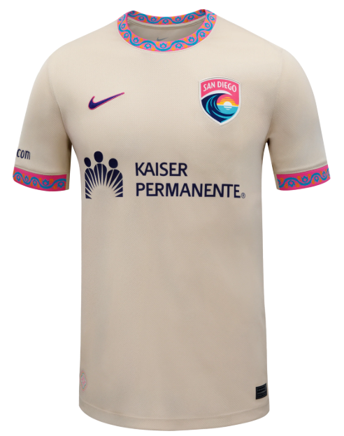
Ranking: 2
Michael’s comments:
This is proof that you need not try hard to be cool. The collar and the sleeve caps do the work along with San Diego’s great color scheme. Fantastic.
Marketing Description from nwslshop.com:
“Wave FC introduces the Balboa Park kit, inspired by San Diego's 1,200-acre urban oasis that has served as the cultural heart of the city since 1868, celebrating SD's diverse heritage while embracing its shared future.
Built on a rich fan base with shades of blue, pink and orange, and included with patterns drawn from the iconic tile work, the kit stands as a symbol of unity”
I like the added context. Sweet and simple. Pay attention, Denver.
Elizabeth’s comments:
I normally hate white jerseys, but this jersey is cream or ecru and so it is exempt from the normal white criticism. I think that balances out the collar and cuff details that scream “look what my kid drew!” resulting in a subtly playful look. I’m here for it.
Racing
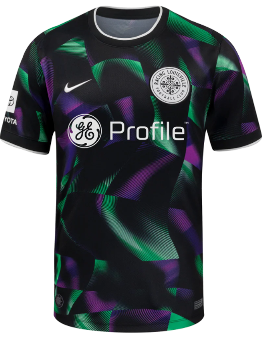
Ranking: 1
Michael’s comments:
I had this one at 4, but Elizabeth had it at 1 so it wins. I think it is a cool jersey. I will likely buy it. I also like the decision to go with “Profile” on the logo. I still hate my GE appliances, but this makes me less angry.
Marketing Description from nwslshop.com:
“Racing Louisville: Third Kit
The Disco Kit pays homage to what makes Louisville truly unique. Louisville is famous for its disco balls, once producing 90% of the world’s supply during the disco era.”
I feel like this description is a little lacking. I think the kit is trying to demonstrate the light effects of a mirror ball with Racing brand colors. Maybe that is apparent without going into a long-winded explanation. Regardless, I am all for “disco”.
Elizabeth’s comments:
Yes I am fully biased but I am also self-aware of this bias which negates the impact of the bias and I just love this jersey. The bright colors aren’t trying too hard and leave plenty of room for some shiny silver eyeshadow in the fit. The cherry on top of this delicious disco sundae is the “Made in Looavul” image that will have a prominent spot on my car as soon as they make these into stickers.