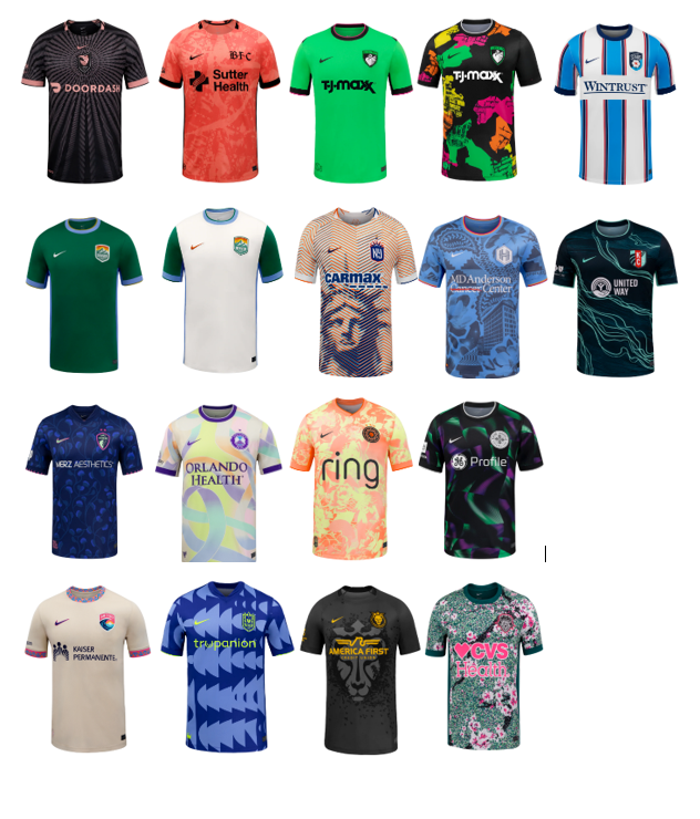
Ranking the 2026 NWSL Kits
All kit photos are courtesy of the nwslshop.com
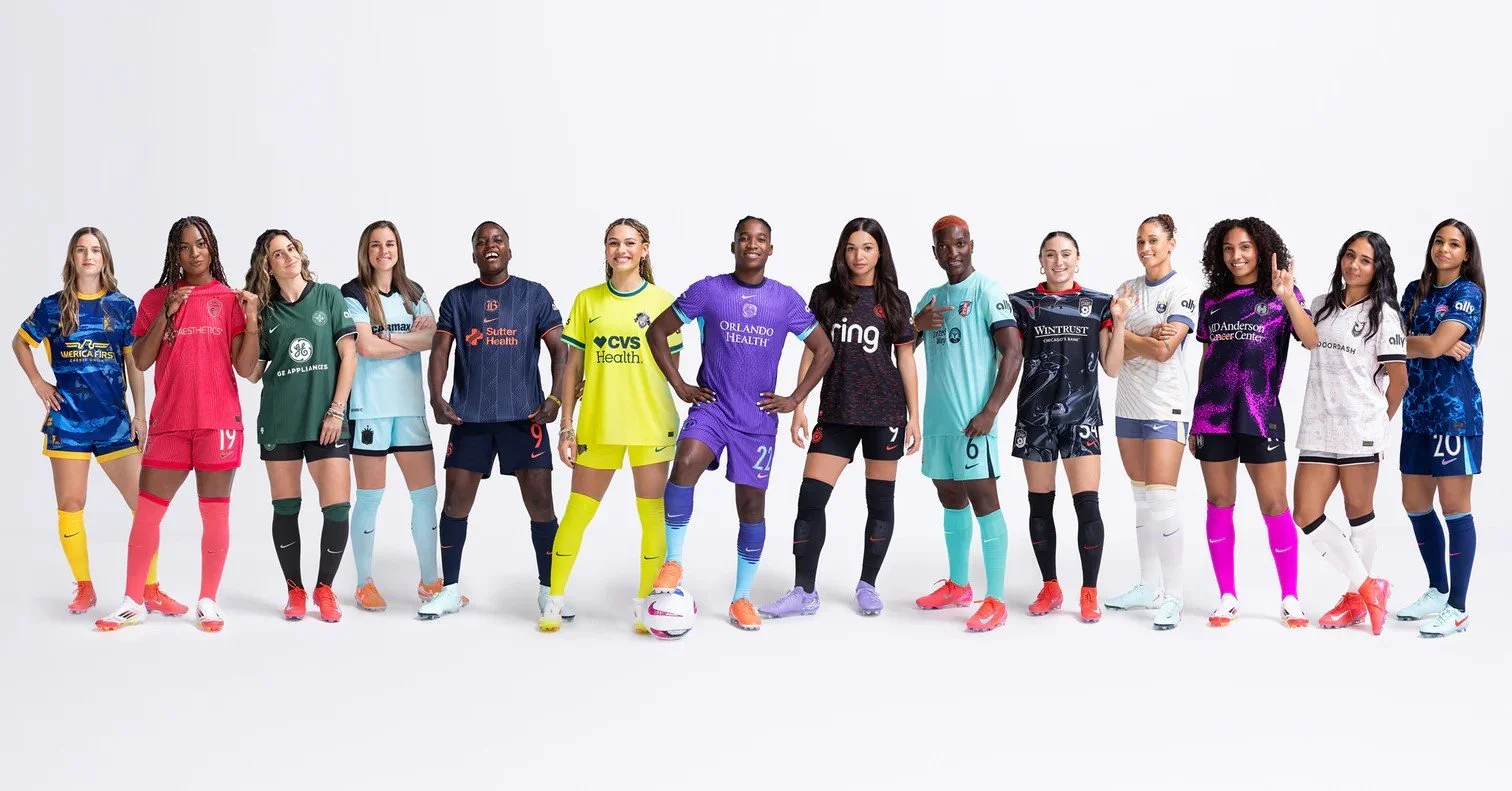
It’s time again for my (or our, since Elizabeth has equal voting rights, except when I overrule her) annual kit ranking! I love kit release day, and this is one of my favorite pieces to write every year. The good news is that the kits seem to get better each season. The hilarious news is that every kit comes with a “corporate speak” description for the inspiration of the kit, and those vary highly in quality and length. Let’s just say that Denver already has a very high opinion of itself and takes its kit marketing WAY too seriously. I hate them even more now. Let’s dive in.
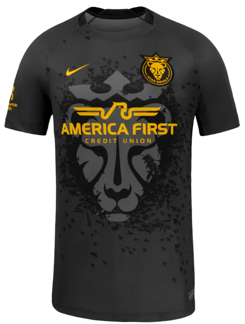
Utah
Ranking: 18
Michael’s comments:
I am starting off by immediately breaking my rules. No matter how Elizabeth ranks this one, I am putting it in dead last. It looks like something that an off-duty ICE agent might wear. Utah needs to get a sponsor with a better name.
Marketing Description from nwslshop.com:
“The Swarm Kit honors Utah’s identity as the Beehive State, with bees surrounding the lioness as a tribute to the state’s legacy of unity and hard work. The heavy black and tonal dark grey as the base is elevated with touches of Utah Royals Gold.
The Swarm symbolizes a simple truth: no single bee defines the hive. Success is built through collective effort. This kit connects the entire Royals ecosystem, from players and coaches to the stadium and every fan in the stands. At its core, the Swarm represents belonging. We are the swarm. We are better together.”
What a mess of hot garbage. Isn’t the point of a queen bee to “define the hive?”
Elizabeth’s comments:
I LOVE the lion watermark. I HATE that sponsor name and logo. If I worked in Marketing for the Utah Royals I would have spent my entire off-season trying to convince Skullcandy to become our jersey sponsor (HQ in Utah) or heck where’s Adobe (also in Utah) when you need them? Probably trying to convince someone to download a free version of Acrobat.
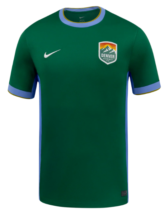
Denver (Primary)
Ranking: 17
Michael’s comments:
I have repeatedly gone on record stating that I highly despise green kits, so I won’t go through the reasons again. I will always rank them low. The badge is cool. It’s boring otherwise.
Marketing Description from nwslshop.com:
“The Inaugural Evergreen kit, the first-ever, for Denver Summit FC, is more than a uniform, it’s a declaration of arrival and a love letter to the place we call home. Designed to honor Colorado’s untamed beauty and mark a historic first season, the Inaugural Evergreen kit captures the spirit of Coloradoans, the ruggedness of our community, and the ambition of a club ready for the first climb.” (It keeps going for a few paragraphs…)
I hope this team loses every match by at least 3 goals if this is the type of self-important drivel we can expect from such a mediocre production.
Elizabeth’s comments:
An entire jersey of the world’s worst color. This is actually the color that the refs should wear. They would blend right into the field, and everyone could just ignore them because they’re usually not doing anything useful anyway.
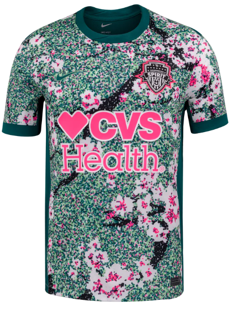
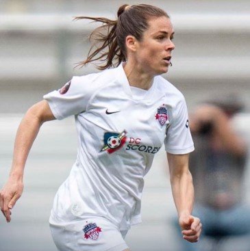
Washington
Ranking: 16
Michael’s comments:
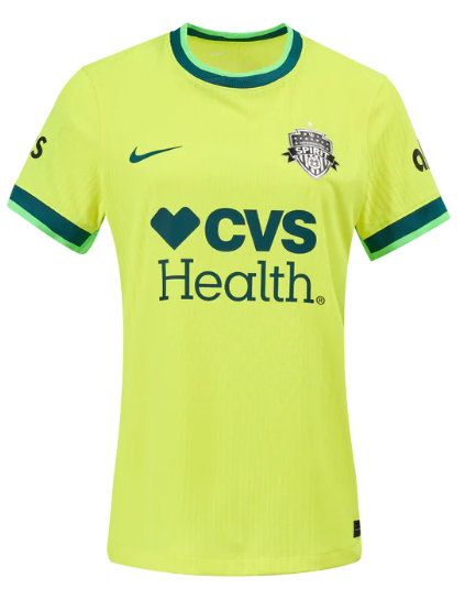
Well, at least the Spirit is trying with its kits now. I liked the highlighter yellow one last season and I get what they were trying to do here, but it is just ugly as sin and also green.
Marketing Description from nwslshop.com:
“The Spirit in Bloom Kit features DC’s iconic cherry blossoms and a dark green Potomac River motif
This kit captures the blossoms drifting gracefully along the river while honoring the stunning backdrop of the Nation’s Capital”
This explanation seems factual and mercifully short, but doesn’t make me like the kit any better.
Elizabeth’s comments:
I initially loved this look (Trinity Rodman was modeling the heck out of it) but then I saw the back of the jersey and had a guttural reaction that I can only describe as negative. If you haven’t seen it, stop what you’re doing it and google it. I’ll wait. Back? Okay glad we’re on the same page now.
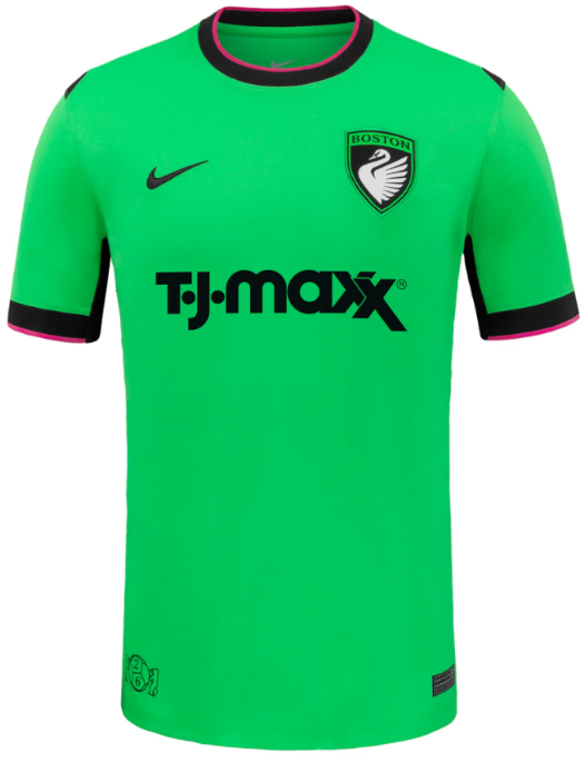
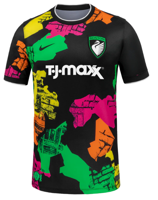
Boston (Primary)
Ranking: 15
Michael’s comments:
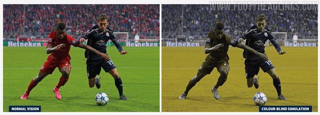
The PRO referees will have one less jersey option this year it seems. This color is pretty much identical to the green kits they parade around in while being out of position to properly judge offside decisions. Why did both new teams go green? Do they hate colorblind people? It’s a better shade of green than Denver’s and Racing’s “Roots” kit but that is just about all this kit has going for it. Surely the designers could have come up with a more inspiring option by going through the racks at an actual TJ-Maxx.
Marketing Description from nwslshop.com:
“The First Light kit marks the beginning of Boston Legacy. Rendered entirely in Legacy green, it reflects the club’s lead color and sets the foundation for everything that follows. Simple, confident, and unambiguous, this kit establishes presence rather than telling a story. The name First Light nods to an opening season and a first step forward. The start of something new, defined not by what came before, but by what comes next. This is the kit that introduces Boston Legacy to the league, the city, and the future.”
They could have just said, “we picked Crayola green, so suck it, losers,” and saved everyone some time from reading that nonsense.
Elizabeth’s comments:
For some reason Michael really wanted to include the new Referee tops in our rankings this year so here goes. Oh? You say this is the new Boston team’s jersey? Are we sure about that? Okay, I mean, welcome to the league, I guess.
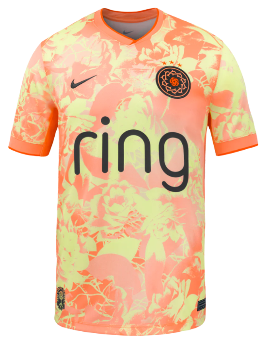
Portland
Ranking: 14
Michael’s comments:
Portland is old enough to know better, so why they keep coming up with dreadful kits is beyond me. Surely there has to be many better ways to do what they were trying to do with this kit. It’s pointlessly detailed for no apparent reason. They should get docked a star from their badge because this kit is so bad.
Marketing Description from nwslshop.com:
“The Portland Thorns Electric Bloom kit radiates the fearless brilliance of a club rooted in the creative energy of our Portland community.
Striking a harmonious balance of grit and grace, this kit features a bold pattern of atomic pink and voltage yellow roses. Electric red and mossy green accents nod to the club’s core brand colors and the moody forests of the Pacific Northwest.”
You can’t tell me that AI didn’t write or at least assist with that assessment. Atomic pink? Voltage yellow? Give me a break.
Elizabeth’s comments:
I’m getting mimosa vibes from this one but nope, they managed to sneak in some flowers on this one too. I would have ranked this higher, but that neck is cutting off the oxygen to my brain. Might as well have sewn a crown of thorns around the collar.
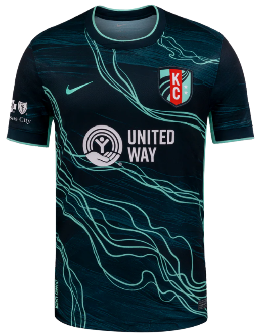
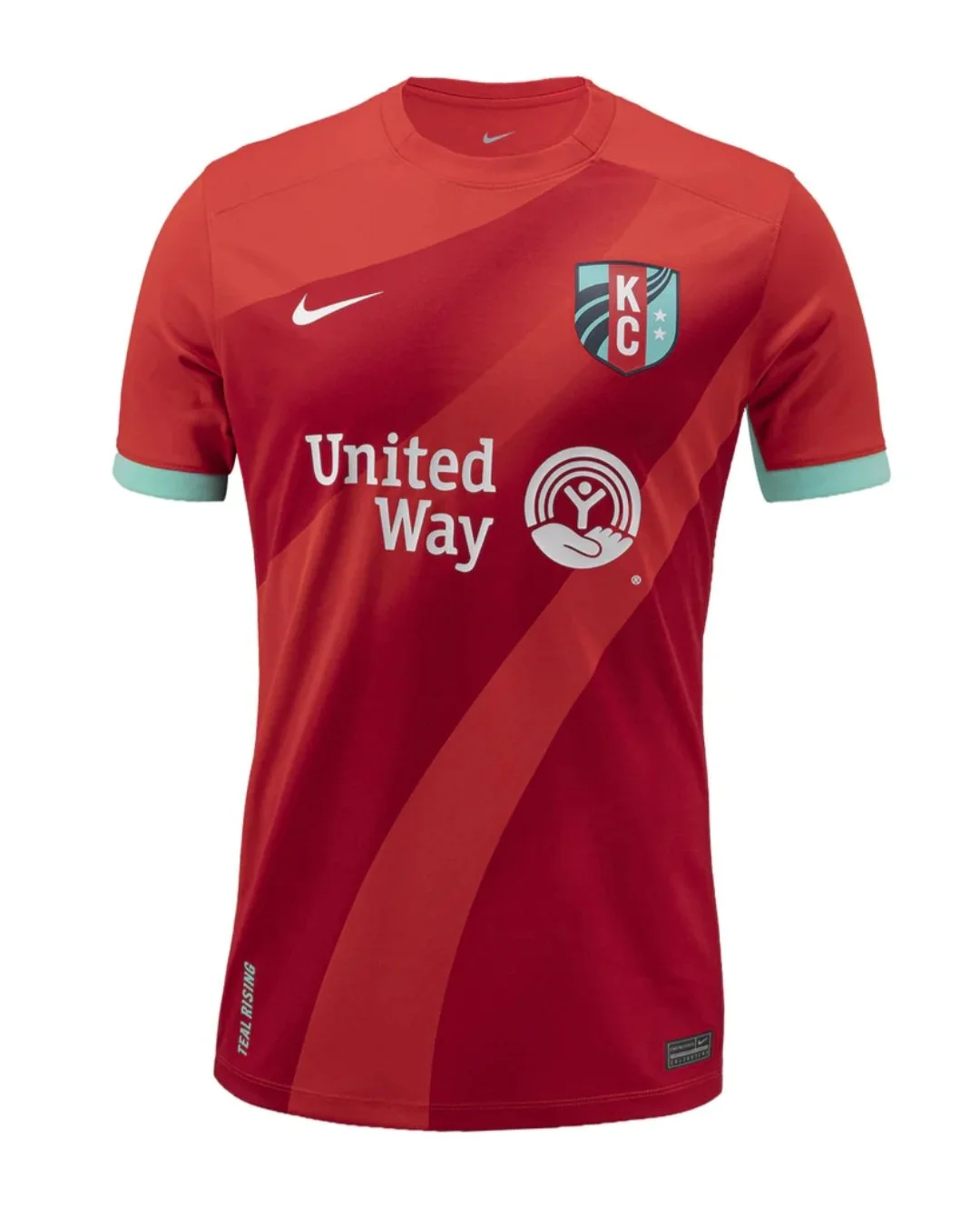
Kansas City
Ranking: 13
Michael’s comments:
I think we are firmly out of the “sartorial travesty” territory now. This kit and every one that follow has some redeeming qualities.
I could see how someone might really like this kit, but that someone isn’t me. Kansas City was probably due an average kit, so they got one.
Marketing Description from nwslshop.com:
“The Storm Kit represents the current that is rising, the bold pattern highlights the current that runs through Kansas City and represents the current rising for the 2026 season
The Storm colorway, drawn from the signature palette of the Kansas City Current, represents the team’s persistence and resilience, the storm is coming”
Also, so full of themselves, but with some evidence to back up their bravado. Paying attention, Denver? Worst of luck in 2026, Kansas City!
Elizabeth’s comments:
Is this a wave current or an electrical current? Probably don’t want to mix those too. While I love a good black-with-mint-accents look, I feel like this been done and someone really could’ve thought just a few minutes more about how to give this team the look that Brittany Mahomes deserves. (Ed: I dislike the Mahomes Family, so she probably deserves that Spirit monstrosity.)
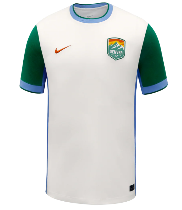
Denver (Secondary)
Ranking: 12
Michael’s comments:
I like a clean, sponsor free kit every now and then. This look isn’t half bad. I am sure the humble folks in Denver just wanted something simple…
Marketing Description from nwslshop.com:
“A tribute to the quiet power and beauty of a Colorado winter.
Inspired by fresh snowfall, capturing stillness, clarity, and cold-weather resilience.
Crisp alpine white base mirrors the snowcapped Rockies and seasonal flurries” (again, it keeps going.)
Holy $#*@, Denver. Have some self-awareness. This kit is alright, but the need to explain “white” boggles the mind. I hate this team. Did I mention that already?
Elizabeth’s comments:
Debut kit, huh? Low-key, colors on brand. A serious look. As much as I hate “evergreen” it would feel wrong to lean into the teal of the logo in the club’s first year, so I think it was well done. Welcome to the league, Denver Trees! Oh wait, it’s Denver Summit? Yeah, they should’ve gone with a different sleeve color.
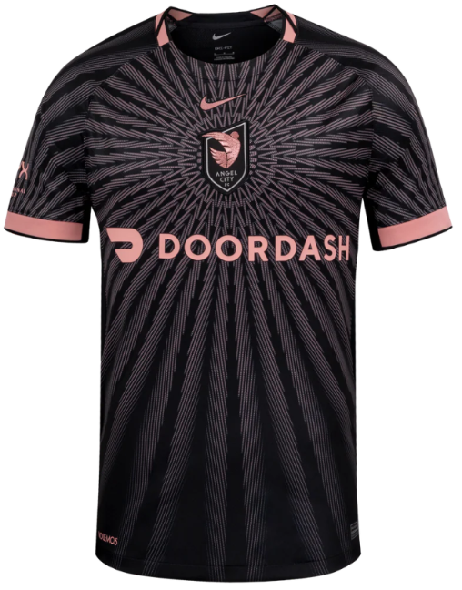
Angel City
Ranking: 11
Michael’s comments:
I actually quite like this one, but that’s democracy for you. It doesn’t always work. Has anyone looked into that? Anyway, I like kits that you can look at and tell exactly who the team is without having to do too much thinking. It screams “Angel City”. I like Door Dash. Sometimes, it’s just that simple.
Marketing Description from nwslshop.com:
“The Flare kit celebrates the 5th season for Angel City and features a special center chest crest.
From soul to sol: A sol rosa sunburst pattern shine from the center”
Pretty straightforward. Let’s see what Elizabeth has to say for herself and her low ranking of this kit.
Elizabeth’s comments:
Ok serious question: are teams now going to have to display a may-cause-seizures warning before matches that feature Angel City? I guess that target visual is needed to draw attention to the logo that has drifted to the center of the chest. Can they even do that? Aren’t there federal laws about logo placement on jerseys?
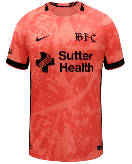
Bay FC
Ranking: 10
Michael’s comments:
I think this is Bay’s best kit to date, but it doesn’t have a whole lot of competition. The alternate logo is cool. I like the idea of embracing a secondary color on an alternate kit.
Marketing Description from nwslshop.com:
“Bay FC's Poppy Kit embodies the Bay Area's strength in connection and community.
The colorway leans into Bay FC's poppy color and is the first appearance of this color as a primary kit application in Bay FC history. The poppy color, as it appears on the kit, symbolizes the beauty and energy of the Bay Area, while the black accents represent our strength and boldness.”
I must be a simpleton, because all I could think of was “orange”.
Elizabeth’s comments:
Poppies are red, violets are blue, this jersey is orange and so underwhelming that I’m abandoning my poem in search of the real poppy red that B-F-C is claiming as their inspiration. And BTW who calls this team B-F-C? Is that a thing? How are we supposed to know that this isn’t the new Boston FC jersey? (Ed: you shouldn’t trust Elizabeth on color judgement. Her parents must have bought her Rose Art crayons instead of Crayola when she was little. Upon a little bit of research, the color “poppy” is definitely in the “red-orange” range.)
Boston (Secondary)
Ranking: 9
Michael’s comments:
Democracy at work again. Elizabeth liked it and I don’t particularly care for it, thus it ends up at 9. I definitely don’t dislike it. It was securely in my “not terrible range”. Let’s see if the marketing description helps.
Marketing Description from nwslshop.com:
“The Common Ground Kit is rooted in the neighborhoods surrounding White Stadium and the shared spaces that shape Boston.
The shapes represent Boston neighborhoods and the brick pattern represents the roads of Boston”
So, not really. I like Boston. Don’t sell past the “yes”. This kit is trying too hard.
Elizabeth’s comments:
Every time I look at this one I like it a little bit more. The 80s neon look is due back for a replay, and it never really took time off from graffiti, so I can get behind the brick design.
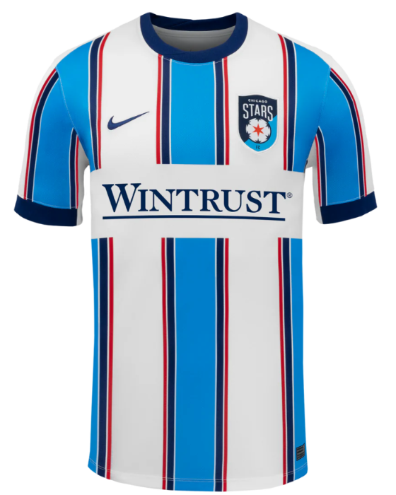
Chicago
Ranking: 8
Michael’s comments:
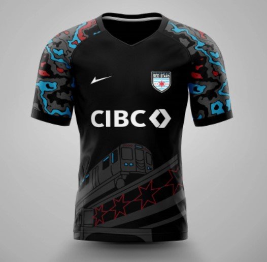
I feel like this kit is daring me to hate it, but I don’t. It doesn’t look like any previous Stars kit, but you also know that it is a Stars kit without looking to closely. Well done, I guess.
Marketing Description from nwslshop.com:
“The 2026 Chicago DNA kit is rooted in the Stars’ iconic palette of blue, white, and red.
Drawing inspiration from the city’s most recognizable landmarks and fortitude, the design features a striking central stripe flanked by four supporting stripes of diminishing width.”
Okay…some of that makes sense, sorta.
Elizabeth’s comments:
Stars and stripes forever! I am incredibly proud to know this reference to a number by John Philip Sousa who I only know because of Captain Holt on “Brooklyn 99” (RIP Andre Braugher, I miss you every day) and that’s all I have to say about that.
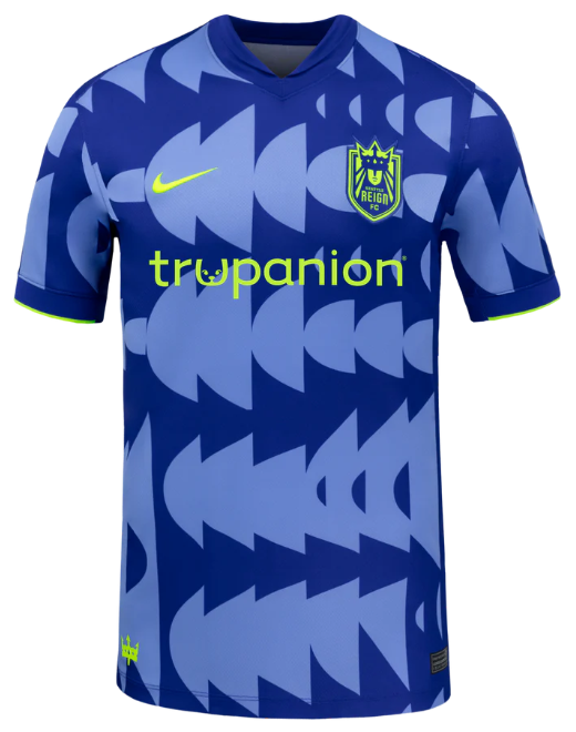
Seattle
Ranking: 7
Michael’s comments:
This is one that I think could have been even better, but I still like it. As always, the queen of the badges does her fair bit of the heavy lifting here. The color contrasts are good, and I don’t quite know what is going on, but I don’t mind it. What say you, marketing department?
Marketing Description from nwslshop.com:
“The Surge Kit represents legacy in motion, a tribute to the foundation built over time and the next generation stepping forward to carry it on.
Deep Concord Blue anchors the kit in heritage, reflecting the history and identity that shaped this club. Royal Pulse signals the rising energy of what’s next. Volt ignites the point where past and future meet.”
That wasn’t particularly helpful, but whatever.
Elizabeth’s comments:
This looks like someone is trying to line up some images in Microsoft Word and Clippy is just not having it. Setting aside any OCD tendencies, the pattern is unique and fun, and I really cannot love that color scheme any more than I do.
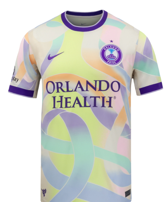
Orlando
Ranking: 6
Michael’s comments:
Democracy fails us again. I moved this one up a spot regardless. I love this kit. It is my number one. Elizabeth has some lame excuse for not liking it that doesn’t make a lick of sense. For me, it is up there with the best NWSL kits of all time.
Marketing Description from nwslshop.com:
“The Orlando Pride 2026 Unity Kit commemorates the 10-year remembrance of the Pulse Nightclub tragedy, symbolizing the strength, resilience, and unity of the City of Orlando
The kit features interwoven ribbons of color coming together, representing the unbreakable bond and collective spirit of the Orlando community.”
As good of a reason as any to design a kit in a specific manor.
Elizabeth’s comments:
I swear this jersey already exists. Someone somewhere out there has worn this jersey to play a football match. Maybe it was in London. Or maybe it was an Upward soccer league, lower division for ages 3-5, but I’m telling you this jersey is not new. If there is nothing new under the sun (so says Solomon) then may I add into evidence this jersey. (Ed: I cannot for the like of me figure out what in the world she is talking about. I have shown her multiple kits that could possibly be close and none of them are the one she is thinking of. Maybe she will change her mind if she sees it in person or on tv.)
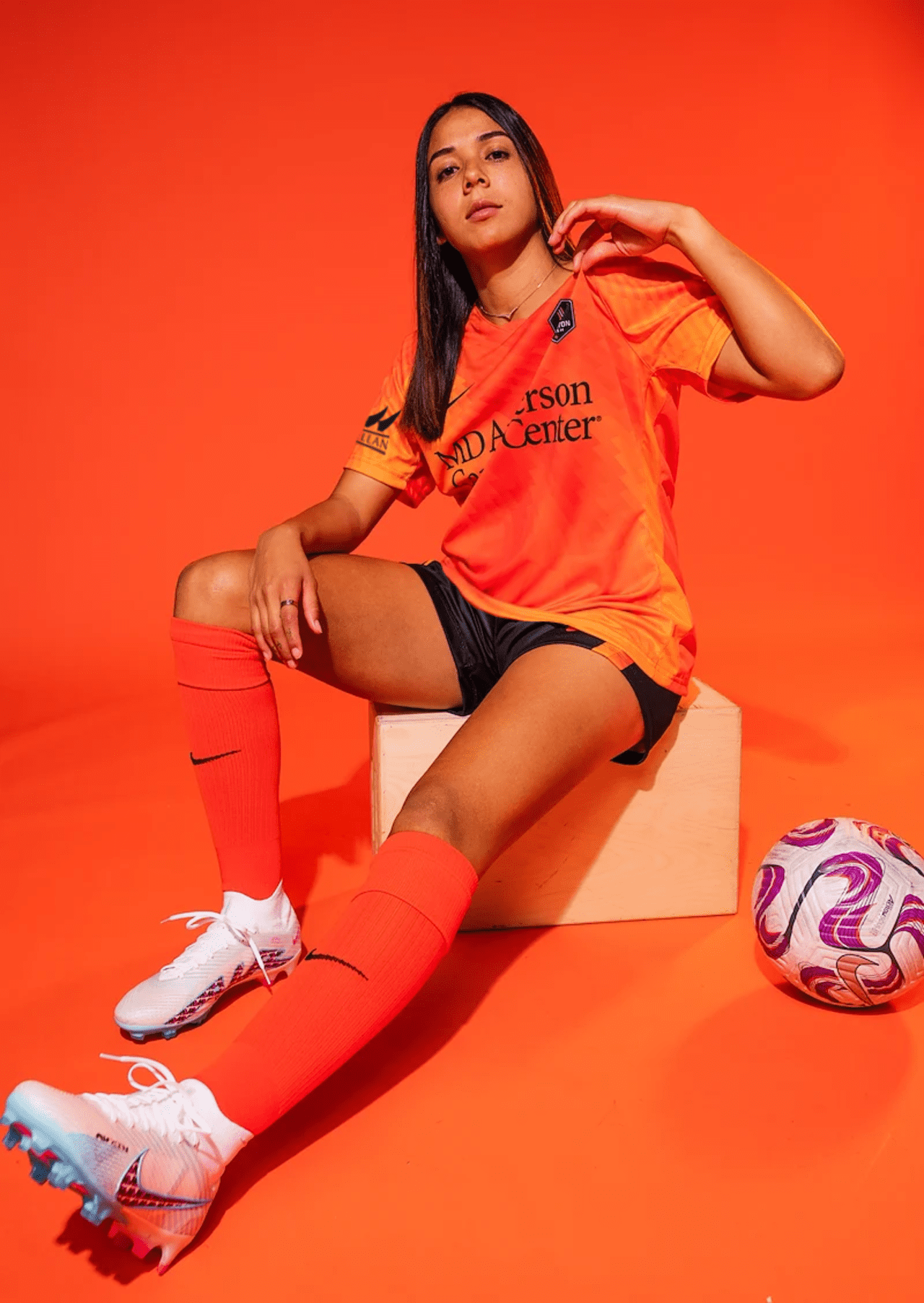
Houston
Ranking: 5
Michael’s comments:
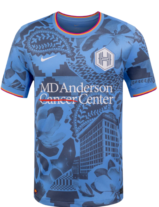
We are now firmly in the “Michael and Elizabeth” agree territory. This kit accomplished what I think Portland and Bay were attempting to do, but with much better success. The contrasting blues work so much better. I did chuckle a little that the residents of Houston might have some sort of soft spot for such and anonymous building. The rest of it very cool.
Marketing Description from nwslshop.com:
“The Houston Chronicles kit highlights the diversity and culture of Houston while also showcasing the southern hospitality that welcomes all, this kit is a tapestry of what makes 'Houston' Houston.
This kit highlights five key elements: the original Houston Chronicle building calls out iconic Houston architecture; magnolia flowers representing Houston’s “Magnolia City”; a paisley cowboy motif inspired by classic bandanas; geometric textiles symbolizing the city’s diversity; and “Space City” representing NASA”
Somebody is going to have to explain to me what is so iconic about the original Houston Chronicle building. Did it transform into a robot or something. Looks like a pretty standard building to me.
Elizabeth’s comments:
This jersey had me at the giant paramecium on the top shoulder. What, you didn’t learn about paramecium and mitochondria in middle school biology? (The mitochondria is the powerhouses of the cell.) Or maybe you’re calling it paisley since it is a fashion print and not a science fair project, but you would be incorrect.
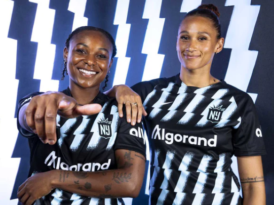
Gotham
Ranking: 4
Michael’s comments:
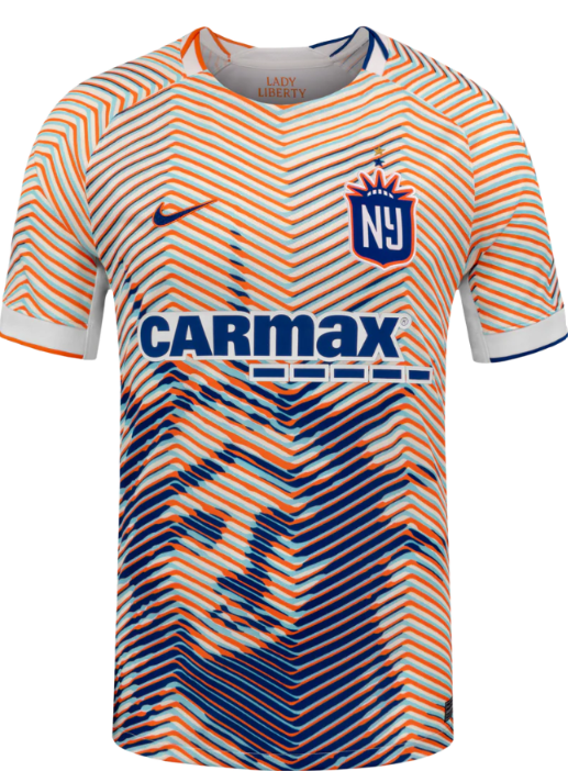
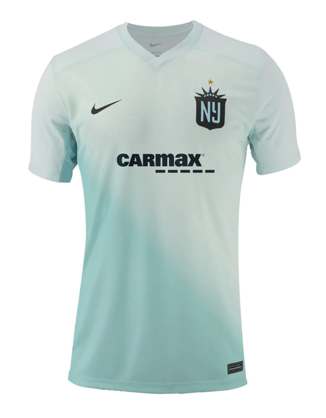
I like the “Mets-ish” color scheme, and the orange around the badge is really working for me. The stacked stars are a nice touch too. My only complaint is that Lady Liberty is a tad bit too big. Having it stop fully below the logo might just look the tiniest bit better. I do have to poke fun at the used car lot sponsor, but hey…I have bought 2 cars from CarMax, so who am I to judge. Okay, I do have to be a little judgy. Doesn’t such a prominent Statue of Liberty remind you of a sketchy car lot or sketchier tax service, or the sketchiest of them all…Saul Goodman.
Marketing Description from nwslshop.com:
“Gotham FC introduces their first third kit, this kit features the blue and orange colors of the New York City flag and showcases the iconic Lady Liberty, creating a jersey that truly honors Gotham and its community.
Features a gold star, symbolizing the team’s status as the reigning NWSL Champion”
Yep, that sums it up.
Elizabeth’s comments:
The orange tiger stripes that fade into a navy gradient to reveal the statue of liberty is literally why third kits were created. And that extra star above their logo representing their current reign as champion is so spicy. Can’t wait to see my girl Jae Howell rocking this little number.
North Carolina
Ranking: 3
Michael’s comments:
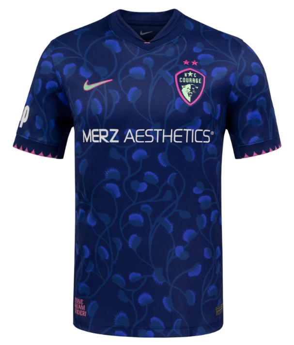
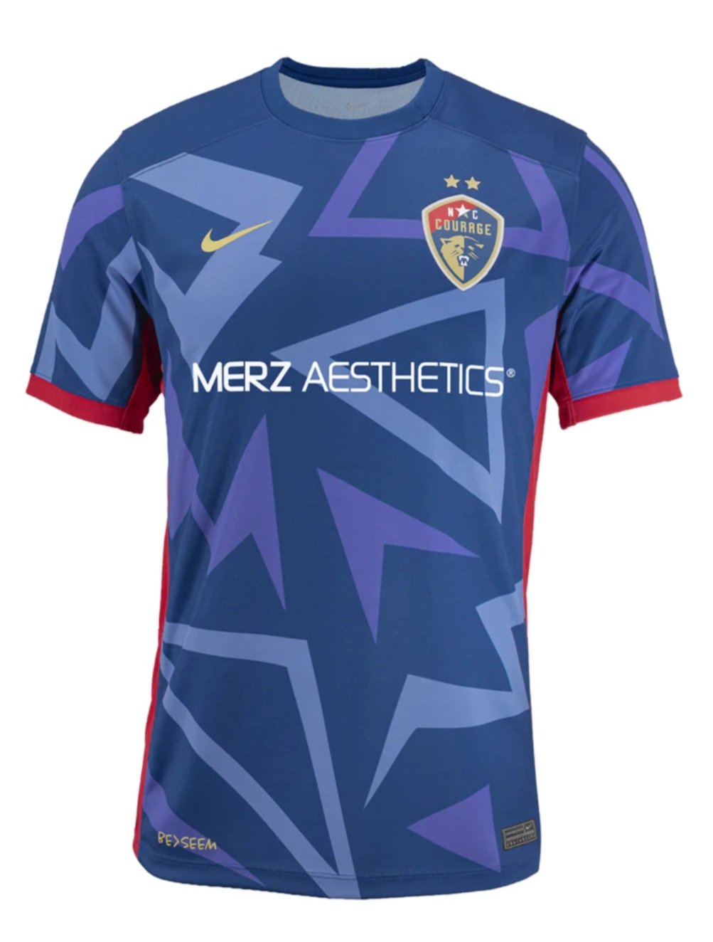
I generally do not like saying anything good about North Carolina, but this is a fine kit. Hmmm…are those Venus flytraps?
Marketing Description from nwslshop.com:
“The “Become” Kit is the North Carolina Courage’s first third kit and completes the trifecta of the three defining words from our Place to Be manifesto: Believe (Triangle Kit), Belong (Very Berry Kit), and Become.
The Venus flytrap pattern represents evolution, knowing when to wait, when to act, and becoming who you’re meant to be. Indigenous to North Carolina and recognized as the state’s official carnivorous plant, the Venus flytrap is woven throughout the jersey in a custom pattern.”
Does anything sound so anonymously corporate as having a three-word manifesto? Believe, Belong, Become? Add “Barf” for a 4th B.
Having been to Cary, I do agree that being physically restrained would be the only reason to spend any more time there than necessary, so the flytrap tracks.
Elizabeth’s comments:
Never in a zillion trillion years would I have known that the “leaves” in the pattern are Venus flytraps, but hey, if you say so Carolina. I am obsessed with the hot pink pops of color and think they would look great if the background pattern was just thousands of blue bananas. This look works for me.
San Diego
Ranking: 2
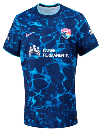
Michael’s comments:
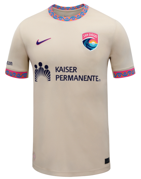
This is proof that you need not try hard to be cool. The collar and the sleeve caps do the work along with San Diego’s great color scheme. Fantastic.
Marketing Description from nwslshop.com:
“Wave FC introduces the Balboa Park kit, inspired by San Diego's 1,200-acre urban oasis that has served as the cultural heart of the city since 1868, celebrating SD's diverse heritage while embracing its shared future.
Built on a rich fan base with shades of blue, pink and orange, and included with patterns drawn from the iconic tile work, the kit stands as a symbol of unity”
I like the added context. Sweet and simple. Pay attention, Denver.
Elizabeth’s comments:
I normally hate white jerseys, but this jersey is cream or ecru and so it is exempt from the normal white criticism. I think that balances out the collar and cuff details that scream “look what my kid drew!” resulting in a subtly playful look. I’m here for it.
Racing
Ranking: 1
Michael’s comments:
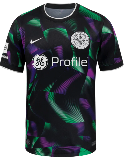
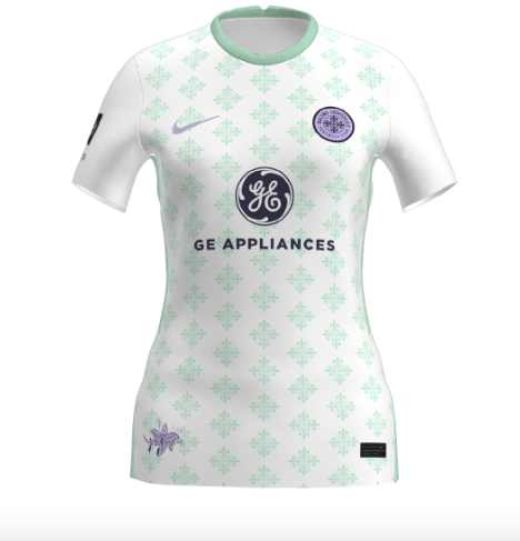
I had this one at 4, but Elizabeth had it at 1 so it wins. I think it is a cool jersey. I will likely buy it. I also like the decision to go with “Profile” on the logo. I still hate my GE appliances, but this makes me less angry.
Marketing Description from nwslshop.com:
“Racing Louisville: Third Kit
The Disco Kit pays homage to what makes Louisville truly unique. Louisville is famous for its disco balls, once producing 90% of the world’s supply during the disco era.”
I feel like this description is a little lacking. I think the kit is trying to demonstrate the light effects of a mirror ball with Racing brand colors. Maybe that is apparent without going into a long-winded explanation. Regardless, I am all for “disco”.
Elizabeth’s comments:
Yes I am fully biased but I am also self-aware of this bias which negates the impact of the bias and I just love this jersey. The bright colors aren’t trying too hard and leave plenty of room for some shiny silver eyeshadow in the fit. The cherry on top of this delicious disco sundae is the “Made in Looavul” image that will have a prominent spot on my car as soon as they make these into stickers.
Ranking the New NWSL 2025 Secondary Kits
All kit photos are courtesy of the nwslshop.com
Welcome to my annual kit rankings, which is my favorite post to write each year. I love kits and I love saying mean things about the other cities in the league (and their sponsors if I think they deserve it).
This year I asked my staff photographer (who also happens to be my beautiful wife) Elizabeth, to help with the rankings.
This year’s batch of jerseys/kits are much better than what the league was putting out a few years ago. Some of those jerseys were atrocities that deserve to be lost to time. Each club is starting to have more of a kit culture and that is a good thing. A couple seem to be having an identity crisis when it comes to their kits (Houston, Racing), but most are starting to be pleasantly predicable from a basic color perspective.
San Diego
Ranking: 14
Michael’s comments:
There is definitely a nursing scrubs theme to some of the jerseys this year. The absolute worst offender is the Wave’s kit. It looks like water, which is on brand, but it is such a downgrade from my favorite kit from last year, the Wave Primary. The swoosh is pink which is sort of cool. Maybe when these jerseys don’t sell, Kaiser can hand them out to their nursing staff. Then again, that may be enough to make them strike again.
Elizabeth’s comments:
Not a fan of this one. I hope the club uses the money they saved by not hiring a creative designer for their jerseys to buy cool giveaways for their games. I'd fly to San Diego for a Savannah McCaskill bobblehead with her cute, signature bun on top. Let’s make this happen, people!
(Ed. I believe the Wave also have a bunch of baseball jerseys they still need to distribute because their field was so poor at the end of the season.)
Chicago
Ranking: 13
Michael’s comments:
Is there a more parochial city in America than Chicago? People from there never actually mentally move away from there even if they relocate to New Zealand. Chicago is like if they took the worst parts of LA and the worst parts of NYC and combined them to make a city. The new badge/crest is a significant step backwards, and the only thing keeping this jersey out of last place is the red accents. Bring back the white kits! It just seems wrong that Chicago won’t have a white option this season. And Wintrust sounds like an evil bank that William Zabka would have interned at in a bad 80s movie.
Elizabeth’s comments:
While I like the red accents ("don't they just pop!", says my inner fashion designer), I'm really getting some patriotic vibes that could make the very sleek US Women's team jersey a little jelly (says my inner teenager from 2019).
North Carolina
Ranking: 12
Michael’s comments:
Personally, I didn’t think the Authentic version of this kit was half bad, but take a look at the replica:
That is an atrocity. It is super lazy. I do enjoy the irony of having “Aesthetics” written on such a boring and dull jersey, so kudos, I guess? I would say that the fans deserve better, but have you ever been to Cary, NC? Don’t bother if not. It sucks. Cary definitely doesn’t deserve nice things, so I am done complaining about them not having them.
Elizabeth’s comments:
Are there tiny white pinstripes in certain lights that could earn this jersey a higher ranking? Yes. Am I in a mood to look at this jersey from several different angles and risk an inner debate a la blue dress/gold dress? Nope. The solid-ish red is too bland for me.
Orlando
Ranking: 11
Michael’s comments:
I have been to Orlando way too many times in my life. I hope I never step foot in Orlando again, unless it is to attend the Pop Tarts Bowl. I don’t think I would even care if my team won! (Not caring if my team wins bodes well for me enjoying this year’s Racing matches.) I like several things about this jersey: the primary color, the badge placement, the gold star. What is off putting for me is the blue/teal accent. The Pride couldn’t commit to adding enough blue/teal to this kit so they half-assed it.
Elizabeth’s comments:
When I attended my high school prom a decade or three ago, I thought that was the last time I'd see the brilliant combination of bright purple and teal, but here it is Orlando. For their jerseys, fan gear, and everything else, they should let Carson Pickett choose her favorite color and really lean into that. Save the other for practice jerseys or leg warmers.
Houston
Ranking: 10
Michael’s comments:
Elizabeth definitely likes this jersey more than I do. It is very “scrubs-y” but the color isn’t bad. It just doesn’t have anything to do with any of Houston’s previous kits. As a 3rd kit, I might be inclined to rank it higher, and I do like the pink socks. I initially thought is read as purple which seemed confusing, but I am sure that it will read as pink on the pitch. Enough nice things…Houston is an armpit of a city. It’s humid, hot and sweaty. I have only been there once. It is never on my list of potential away games.
Elizabeth’s comments:
The fuchsia! The magenta! The "purple!" (per my color-minimalist husband.) The number of names that I could give to this pink is almost as amazing as the splatter design that will make each player stand out on the field the same way Yuki Nagasato stands out in everything she does. (We have an original Yuki canvas that I commissioned in 2021, whatever, stop asking about it already!)
Portland
Ranking: 9
Michael’s comments:
We’ve moved into the middle of the pack territory with this kit. This looks like a Portland kit and I don’t have to think to much about it. I like my Ring doorbell. I hope to make it to Portland someday. I heard that the rest of Oregon sucks and is just west Idaho. I think I quoted that in last year’s piece. I am too lazy to look it up.
Elizabeth’s comments:
There's a reason why Dwight painted Michael's office black when he thought he was taking over the Scranton branch of Dunder Mifflin: it's Intimidating. Like Reilyn Turner. The subtle red keeps this jersey from looking like a cute "LBJ" (little black jersey) that slims the hips. I think this jersey is a sleeper.
Utah
Ranking: 8
Michael’s comments:
I am so freaking mad at this jersey! On first glance I loved it. Then I hated the stupid background. I say this every year, but the yellow/blue jersey combo is my favorite in all of sports. The badge on this jersey is awesome. Why did they have to screw it up with whatever that stupid background is supposed to be. With either shade of blue used as a solid base, I would probably have ranked this kit first. Please get a new jersey sponsor. Still, I wouldn’t mind a Salt Lake City away day.
Elizabeth’s comments:
The most soccer-jerseyist of soccer jerseys, from the generic pattern to the wide sleeves and side stripes. But I have no doubt that Paige Monaghan will give this look an upgrade with her pink scrunchy and high pony.
Racing
Ranking: 7
Michael’s comments:
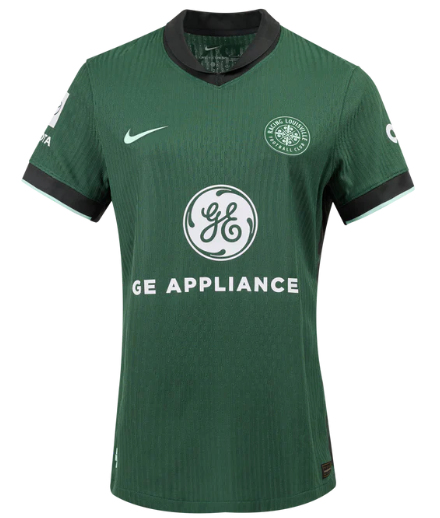
Elizabeth and I ranked the jerseys without input from each other. I had Racing at 7 and so did she. It’s OK if you like green, I guess. The green is called “a variant of Racing’s mint” in the press release. That’s kind of like saying royal blue is a variant of periwinkle. I hate green kits. If you have red-green colorblindness, this is what a soccer match looks like when it's red vs. green.
I am not colorblind, but I do find the green kits harder to see, especially on smaller screens. There just isn’t a really good reason in my mind to have a jersey that is so off-brand from a color perspective. Racing can explain away all the reasons they chose it, but jerseys shouldn’t need deep explanations. And Roots are brown the last time I looked.
Also, the GE Appliances logo is too prominent. I have a GE washer and dryer. I hate them with a passion. My GE microwave stopped working out of the blue six months after we moved into our new house. If Racing survives much longer, I hope they get a higher quality sponsor.
Elizabeth’s comments:
I had to do a double take on this one. When did we become the Racing Shamrocks? Seriously look at the badge on that 1990s-hunter-green jersey and tell me you don't see a four-leaf clover? If it's the good luck charm that we need to make the playoffs, then I’ll take 11, please! Until then, I just hope our players can see each other on the green field. Not that anyone can keep their eyes on the speedy Lauren Milliet anyway. But you can't miss Savannah DeMelo's curly pony whipping around as she shreds defenders on the way to the goal, so maybe we'll be okay after all.
Gotham
Ranking: 6
Michael’s comments:
I hate this jersey, but Elizabeth ranked it high. At least it is on brand and all of Gotham’s jerseys should probably be two-toned moving forward because the club seems committed to it, which is good thing. Gotham just happened to choose my least favorite way of being two-toned on a jersey. It looks like a warmup to me. By the way, when are we going to stop letting Gotham get away with having NY in their name. They scream New Jersey. This team has never and probably will never be located in NYC. I like Carmax and their easy way of doing business, but doesn’t used car lot scream Jersey? Did you know that Carmax started out as an offshoot of Circuit City? Circuit City was always second fiddle to Best Buy. I demand to end any NY references to Gotham going forward!
Elizabeth’s comments:
The subtle vneck, the black neck and shoulder accents give this jersey so much attitude. Like they have players who could swap put this jersey for a goalie kit in 90 seconds flat if called upon. I’m looking at you, Nealy Martin. And if they look like they have a chip on their shoulder(s), then that’s apropos. Jaelin Howell can and she should. The team will rock this jersey this year.
Washington
Ranking: 5
Michael’s comments:
Although Elizabeth may disagree on this one, I think we have moved firmly into “nice” section of the rankings. I have hated every other Washington jersey that I have ranked, but I love this one. It was my top choice, but that’s democracy for you. Many people despise yellow and yellow jerseys. I love them. I like the mix of greens and yellow. I hope Washington sticks with yellow on future kit releases. I wonder if anybody will still be living in Washington DC in four years.
Elizabeth’s comments:
Can I just quickly highlight some of the bright spots of this jersey, with the perfect Trinity of bright yellow, blue, and green? Let me find my sunglasses first. Like it matters. Ms. Rodman could dominate the field in Hammer pants if she needed to.
Seattle
Ranking: 4
Michael’s comments:
I think Seattle always does well on their kits. It’s a shame to see the Black Future Co-op Fund go, but a clean, sponsor-less kit from time to time is refreshing. The reborn Reign badge will always do the heavy lifting on the Seattle kits, but I like the pattern, and the shorts really set off the shirt. It’s a fine addition to the Reign kit history.
Elizabeth’s comments:
The no-logo look should Reign supreme, but I was a little distracted by what I assumed was AI-generated lightning bolts. I cheated on this one and had a peek at the shorts and then fell in love. I'd say they've now (Fish)locked-in a good look for Jessica and team this season.
Bay FC
Ranking: 3
Michael’s comments:
I typically don’t like black kits, but black kits with the right accents can be real winners. This jersey wins my “Street Wear” award for being the best kit to be worn by supporters when they are out and about. It reps, without screaming “look at me”. I love the prominent “B” in the middle of the shirt and the logo seems slightly oversized to just the right degree. The background works without being a distraction. It’s classy.
Elizabeth’s comments:
I like the clean look of this dark jersey: the stacking of the B badge, the Nike swoop, the sponsor logo...like a vertical billboard. Not very interesting but not trying too hard either. Quite the opposite of Asisat Oshoala, who will elevate the look with her hairstyles and moves.
Kansas City
Ranking: 2
Michael’s comments:
Proof that you don’t need to overthink to have a good kit, this year’s Current jersey is effortlessly on brand. You always get bonus points repping a charity, even if the United Way doesn’t have the greatest reputation. Kansas City does get full of itself from time to time, so it was nice to see them get embarrassed in the Super Bowl. Still, I would love to attend a Current home match one day.
Elizabeth’s comments:
Sleek, on brand, with that perfect balance of light teal and the only red “KC” on the internet not associated with the loss of the three-peat right now. And if I could hand-pick a sponsor, here's one I'd be honored to have.
Angel City
Ranking: 1
Michael’s comments:
Neither Elizabeth nor I had this at 1. In fact, we both had it at 3. However, we disagreed on some of the other kits so Angel City ends up as the top choice. I can live with that. It’s a fine kit and while it is busy in the background, I feel like it is busy in a meaningful and useful way. The pink accents are always nice on these kits. When I ranked this kit I downgraded it to 3 from 2 because DoorDash always seems to screw up my orders and now, I am an Uber Eats guy. That’s pretty petty, so I guess that it’s justice that it ultimately didn’t matter.
Elizabeth’s comments:
Long-time, swooning fan of the ballet pink, but the chinoiserie-style background elevated this jersey to a full-on fashion piece! Girls' night out? Yep! Bachelor party? Heck yeah! Cleaning the gutters? Maybe find something else. And there's that little vneck again, winking at you, contributing to the overall innocent look of veteran players like Sydney Leroux and Christen Press who are plenty guilty of plowing down their share of defenders. If I only bought one jersey this year, this just might be it.
Ranking the 2024 NWSL Kits
On the whole, the league did much better this year with kits. Although they stuck to a template for the the secondary kits, at least we got some color. Some of secondary kits work better than others (see below), but even if some of the primary kits were a little “try-hard” there are some really fine kits this season. However, it's good to know that Washington is still there to be the floor when it comes to rankings. I will rank the secondary kits, then the the primary kits. Let's dive in…
Secondary Kits
The one that doesn't work:
14. Washington Spirit
As far as I know, the Spirit don't have any history with the color yellow, so this gradient highlighter yellow to Post-it note yellow may be a nod to the jersey sponsor CVS as a place to purchase over-priced office supplies. Regardless, it's bloody awful and therfore true to Washington's form.
The ones that kinda work
13. Chicago Red Stars
I hate the badge and the blues are “greener” than they need to be. If they stuck to a single color I might have been on board.
12. North Carolina Courage
It's basically a color issue for me on this one. I am not crazy about either shade.
11. Bay FC
It isn't great by any means, but it beats a straight black kit. The inaugural season patch is cool and I think the badge works in orange.
10. Portland Thorns
It's their color choice, so you have to respect them for sticking to it. The badge seems like a downgrade.
9. Racing Louisville
It isn't especially bad or good, just rather anonymous. It looks like a warm-up. The gradient doesn't do it any harm, but doesn't add anything.
8. Orlando Pride
It really is quite similar to Racing’s secondary kit, but the colors just work better. The swoosh is nice on this one.
7. KC Current
This one comes close to working, but I feellike a teal to mint gradient would have been the way to go.
The ones that work
6. Houston Dash
This one is what the KC one should have been. It also gave Houston a chance to highlight the blue in their color scheme for once.
5. Angel City
It's fairly straightforward, but the different shades of light pink work together. The badge pops on this one.
4. NJ/NY Gotham
The color scheme is fine, but the star on top of the Lady Liberty part of the badge really works on an understated kit like this.
3. Utah Royals
Even based on a template, this is a fine jersey. I am partial to the blue/yellow kit combination, so this one really works for me.
2. Seattle Reign
This one works mainly on the heavy lifting of the returning Reign badge. It has a simple but classic feel. As always, the jersey sponsor boosts the Reign kits.
1. San Diego Wave
To be completely honest, this jersey benefits because the previous Wave kits were so bland, but it is very pink and thank goodness for that (finally).
Primary Kits
Kits that are still too boring
14. Washington Spirit
The red, white and blue color combination is the most successful combination in the history of the world, so the Spirit decided to forgo that once again and stick to black and white. This kit is just stupid and pointless.
13. Bay FC
Bay is already stating it's intent to overtake the Spirit for most boring kits every season. This one is only redeemed by the patch.
12. Angel City
You're fooling nobody Angel City. This kit is just a lazy reworking of the previous ones and the effect on this one is worse.
11. Portland Thorns
If those triangles are supposed to represent thorns, then it is a very lazy attempt. I'm not sure what to call that shade of red other than boring. The badge is a downgrade.
The “Try Hards”
10. Orlando Pride
It isn't boring, but that is the only thing going for it. Houston should sue because orange belongs to them. The sleeves make it worse.
9. Chicago Red Stars
If this one just calmed itself down a bit, it could have worked. Picking a single pattern and applying it uniformly would have been a hit. This one is a real lost opportunity.
8. North Carolina Courage
There is simultaneously too much and nothing going on with this kit. If you strip off the shapes it is dull, but the shapes distract. It will be interesting to see how this one reads on the pitch.
7. Houston Dash
The black accents work, but the pattern seems pointless. It does have a little bit of an 80s Houston Astros jersey feel, but I love that jersey and don't love this one so I am blaming the pattern.
Not quite there but nice effort
6. Racing Louisville
It's already been said, but this is a sweater vest kit. If the pattern would have been applied to the whole shirt it might have worked. At least it's lavender so that's a plus. The argyle is nice. DAMN THOSE STUPID SLEEVES!
5. NJ/NY Gotham
Gotham is sticking with the sash. Sometimes it works. This time it doesn't quite do it for me. It's still better than half the league.
4. Utah Royals
You definitely see what Utah is trying to do with this jersey, and it almost works. You have “Royal” in your name so why not use royal blue? That seems like a no-brainer to me, but I always prefer royal blue to navy. The mountain motif is nice, but a little blue in the mountains might have been nice.
The great kits
3. Seattle Reign
Even though I just said that I prefer royal blue to navy, it works with the gold on this kit. It's simple without being boring. Look at that gorgeous badge! I will say it once again, “Welcome back!”
2. KC Current
This is how to work a patern! It connects with previous kits and the pattern feels “currenty” without hitting you over the head with it. The teal accents work and the United Way logo seems right at home. In other years this is the best kit, hands down.
The Beautiful One
1. San Diego Wave
It's perfect. No notes. I get what it's saying. It speaks to me. The first classic kit in league history.
A Hater's Guide to NWSL 2023 Kits
UPDATED 3/24/2023 TO INCLUDE KANSAS CITY
As Super Hans says…
People will bend over backwards to accept mediocrity. This year's new kits are a case in point. None of these kits hold a candle to some of the excellent kits being produced by the USL W League. However, this post isn't for the fans who like the new kits. This post is for the vast majority of people who hate one, most, or all of the new 2023 NWSL kits.
Zach Allen-Kelly was nice enough (mean enough?) to add his comments. His additions will be labeled ZAK.
Kansas City
The shorts and socks are nice, but people don’t buy those, so the fans are basically left with another boring white kit. Minus the logo and the badge, it’s virtually identical to the new Courage kit. In a fair world, those two teams would be forced to play each other in these terrible jerseys both times and somehow both come away with zero points. In addition, the Current should be given a 20-point deduction in the table for trying to sell this as the “ice kit”. Their fans of course love it for some reason.
ZAK: I feel like we've forgotten that THE WHOLE PURPOSE OF KITS IS TO TELL THE TEAMS APART.
What this says about you if this is your favorite kit: You don’t deserve nice things and luckily for the rest of us, you will probably never get them.
Louisville
Patterned kits are always divisive, so this really isn't what this fractured fanbase needs (not insignificant sections of fans continually give the front office a pass on just about anything and everything). Just do an all lavender jersey already! After picking an inaugural home kit that had flowers and bugs on it, Louisville decided to go with houndstooth next, so elitism abounds. My cursory search didn't really yield much in the way of houndstooth being used for sports jerseys (Secretariat aside), so this kit is potentially a first. However, everybody’s least favorite college football team Alabama likes to sell houndstooth merchandise to honor Paul Bryant. That man won a lot of football games, but also ran a camp where he withheld water from his players. Bryant and coaches like him are one of the reasons the coaching profession is still full of egotistical abusers. Alabama also tried to trademark houndstooth merchandise even though it was invented a few thousand years before the state of Alabama was. Louisville would like to mimic the winning Alabama has experienced and is already pretty adept at the whitewashing aspects of it, so why not pick a houndstooth kit?
Also, why is the badge mint? It's either a try-hard detail or a goofy decision. Regardless, it just seems odd to have a badge change color to NOT match the jersey. Still, it's a good kit for the NWSL, but anything that isn't either solid black or solid white would be. Congratulations, you tapped in a 6 inch putt.
The big question is will I buy it?
I'm the jerk who last year swore not to buy the new kit, but obviously I will. It’s slightly aristocratic in its design, so it will fit nicely into my rotation of Lacoste shirts and Arsenal gear. Then they also released this gem. I hate giving these people money, but I also have expensive season tickets so I will do it anyway because I'm the worst. I hate Soccer Holdings LLC but I hate myself even more evidently (not really, I really am more like Terrell Owens).
What this says about you if this is your favorite kit: You insufferably correct people’s pronunciation and ask them where they attended high school.
Portland
Nike is in the backyard of Portland, so this is a perfect chance to remind you that Nike is the perfect kit supplier for the NWSL as it too does the bare minimum to improve on its history of human rights abuses.
In a league that actually cared about having quality kits, this one would surely be in the either love it or hate it category. It's definitely unique and nobody can fault Portland for trying something different. In this league it's a top tier kit. But holy hell is it goofy. It's a way too easy target for Ed Hardy and tattoo jokes. It's definitely a little preoccupied with death and pain. There's the main quote, the Romeo and Juliette reference, the DAGGER, and the tiny drop of blood. It's trying hard to be hard. In reality, wearing it would definitely make you look like a less threatening soccer hooligan as opposed to more threatening one. Kudos for the dark shorts, but did they have to pick one of the ugliest colors possible.
ZAK: I will add that there is a pretty big difference between the “Authentic” shorts and the “replica” shorts.
Also, this kit is screaming for “THORN LIFE” across that empty patch on the stomach. Missed opportunity.
What this says about you if this is your favorite kit:
You have a tattoo that you never show in public and a fake nose ring.
Washington
The theme of these kit is "screw you". On original examination you might see this as the Spirit giving a middle finger to the league by saying the restrictions on kits are so bad, that we aren't even going to try. Upon closer examination, that middle finger is intended for a much broader audience. The audacious Thorns kit is priced at $110 in its replica form (a stupid $195 in authentic form) so imagine my surprise when I saw that both the black and white versions of the Spirit kits are priced at $120. That is basically begging any rational person not to buy it and extorting money from any irrationally fan who does. This kit is the most boring kit and doesn't even try to disguise it. I guess I would kind of respect that, except the team has never had good kits.
ZAK: BuT tHe CrEsT iS sHiNy.
What this says about you if this is your favorite kit:
You hate yourself so much you don't understand that you deserve better.
Gotham
It's another in a long line of black, navy, or dark purple kits for this league, but you have to say that 1) it's an upgrade over last year, 2) it's consistent with the brand, and 3) it's sort of interesting. On the other hand, would it have been too much to ask for a reverse of the blue and black colors? I get why they stuck with diagonal (but broken and fuzzy?) stripes, but vertical would have been better in my opinion. This would be a middle of the pack kit in a more colorful landscape, but in this one it rises to the top with a bar set very, very low. Not hateful enough...the people that live in the state where this team plays its home games (that nobody attends) are evidently not smart enough to pump their own gas (ditto for Oregon excluding the parts that want to become part of Super Idaho, or “Greater Idaho” as the movement would call it. It’s hard to imagine any addition to Idaho making it worse).
What this says about you if this is your favorite kit:
Somehow you're the "smart one" in your friend group, but your friends are really, really stupid.
Chicago
Sticking with the black base kits, this one from the Red Stars is another one in a worrying longer line of downgrades over what their past kits have been. There is no reason for this kit to be black. It's better than the stupid camouflage/L train kit, but being worse than that one would be nearly impossible. The Red Stars once had great light blue kits and their away kits actually make the white work (usually). Now, like everyone else they seem to be obsessed with black kits. Black kits are almost always boring. The grey background pattern won't read unless you're right on top of it. There's a reason it was launched with the player's wearing street clothes...the jersey by itself is dull as mud.
ZAK: STOP. DOING. BLACK. HOME. KITS. IF. ONE. OF. YOUR. TEAM. COLORS. ISN’T. BLACK.
Light blue, white, and red is such a dope color combo. USE IT!
What this says about you if this is your favorite kit:
You see your "Goth" phase as the peak version of yourself but everyone else who knows you prefers literally any other variation.
Houston
Breaking up the monotony of the parade of black and white kits is Houston's retina scorching La Estrella kit. You have to hand it to the Dash. They are predictably defiant in their choice to stick with the orange jerseys. (Sidenote: I am one of those annoying people who likes to remind you that orange the color is named after the fruit. I really am an insufferable know-it-all sometimes.) Once again, the details won't read on TV, so this is a jersey that invites people into your personal space to get the full effect. I actually wouldn't mind this kit so much but there is absolutely no desire for this club to try to work in a secondary color. Once upon a time they did, and those kits were much cooler. The Dash's home kits, like the Red Stars' kits are on a downward spiral. I expect this to ultimately end in the team coming out matching Otto the Orange costumes in 2025.
ZAK: The Dash consistently do the bare minimum of “has team color, makes home kit team color” which in the NWSL is good enough to be near the top of the kit rankings.
What this says about you if this is your favorite kit:
You get dressed in the dark and almost never do your laundry.
San Diego
Ever the Robin to LA’s Batman in the SoCal consciousness, San Diego fumbles any opportunity to outdo its neighbors to the north. The club has an excellent color scheme, but steadfastly refuses to use it in their kits. San Diego’s kits are screaming to eternally be a mix between hot pink and teal, but seem stuck in navy and white. It’s a safe choice that will never offend. It’s passionless, which probably explains why major league sports never seem to work in San Diego for long periods of time. The weather is too nice and there is too much other stuff to do. This kit is a warm-up plain and simple. I will be leading the riot next year if the Wave’s kits aren’t 200% better.
ZAK: YOU HAD TWO TRIES AND YOU DID A WARMUP BOTH TIMES.
What this says about you if this is your favorite kit:
You go the to the best Italian restaurant in town and order “buttered noodles”.
North Carolina
Another in long line of “the details won’t read” kits, this jersey looks like a fingerprint with sweater pills. The badge would have been cool 30 years ago, but now just looks like it purposefully tries to hide the team's name. This kit doesn’t deserve more than 3 sentences written about it.
What this says about you if this is your favorite kit:
You go to Baskin-Robbins and order fat free vanilla frozen yogurt even though you have a full gallon of it at home.
Orlando
The Pride made a minor update to their away kit, so it merited inclusion along with the new home kit.
HOME
Meh.
Could be better, could be worse. It's purple at least. It goes against the current trend by having less black in it. However, it is infinitely worse than the last home kit. It will look solid purple on the field and on TV, so once again the details won't translate.
ZAK: Hey, you can tell what team they are! Passing grade.
What this says about you if this is your favorite kit: You are slowly having all of the hope sucked out of your soul.
AWAY
Really more of a 1.5 update than a new kit, it merits inclusion because it continues the positive trend of moving to dark shorts and you can actually read the numbers this year. It still says “To the Moon” in the interior neckline, which for anyone over 45 probably brings to mind the threat of spousal abuse. I know I am starting to sound like a broken record (a dated reference that is now back in style), but the details are lost unless you are right next to it. The badge could add color but doesn’t. All in all, maybe Orlando is pulling Disney and making you pay twice for something that definitely isn’t’ worth it.
ZAK: So close to being really good if they had just made the design dark enough that you could see it from more than 6 inches away.
What this says about you if this is your favorite kit:
You join a gym every January thinking “this year will be different”, but you’re back to old habits in March.
Angel City
The home of blockbusters that nobody asked for once again brings you a kit that’s all sizzle and no steak. There’s a lot going on, and you can customize a patch:
However, that’s just to distract you from the fact that this kit is hot garbage. New Butchertown Rundown host Kaitlyn Whiteside says the kit reminds her of a water stain on her old Crosby, Stills, Nash, and Young album. I think the outline of LA is there to remind people where they are since nobody that can afford to sit in the good seats at the games is actually from LA. Los Angeles is full of people trying their best to pretend to be real human beings, so a kit that is trying to pretend it’s anything other than a nothing kit wit unnecessary details seems appropriate.
ZAK: No one outside of your city knows what your city looks like in silhouette on a map, even if you’re LA. I’m a geography nerd and even I would not have noticed that’s what the design was until I was told. 2022 ACFC away was my favorite kit last season so this is a pretty big downgrade.
Patches are great though, love patches.
What this says about you if this is your favorite kit:
You can’t understand how the cryptocurrency market crashed even though you never really understood how it worked in the first place.
OL Reign
The OL Reign calls this kit the “Purpose” kit and the purpose must be to give you vertigo. The disorienting mix of patterns on this jersey is there to distract you from the fact that this is definitely the most pretentious club in the league. Too full of themselves to represent a single city, this club would rather represent a club that doesn't have the greatest history when it comes to doing right by its female athletes. Credit where credit is due for being somewhat adventurous, but is two shades of blue really that adventurous?
ZAK: Please just be the Seattle Reign again. Remember this? Everyone loved this.
Have you ever tried to explain the OL thing to a casual fan at the stadium? It’s a nightmare. Your team name should not require a 5 minute VOX explainer video.
The kit’s fine but it does kinda look like someone tried to take a picture of a computer monitor with their phone.
What this says about you if this is your favorite kit:
You are fully secure in your identify and that identity is “irritating to the point of ridiculousness.”
2022 NWSL Kit Rankings
I had the idea to do kit ranking piece last year, but the idea occurred to me late in the season, so I sat on that idea for several months and decided to wait until the 2022 kits were released. I waited….and waited…and waited…and finally last week the Wave abandoned all hope toward having any creativity and released their away kit. This was the last kit to be released for the season, so I could now start the process of ranking the kits.
Methodology
Feel free to skip this part if you are uninterested.
I created a survey to send out to content creators who had assisted me in the past. I attempted to get representation across all teams, and most teams were represented. After reviewing the results, I don’t think any additional data would have swayed the choices too much. The respondents generally didn’t tend to overrate the kits for their favorite team (minus one obvious exception), so I felt like I got a decent sample. The sample is nowhere near statistically validity, but that wasn’t the point anyway.
After receiving the responses, I analyzed the ranking twice. First, I removed the respondents’ rankings for their favorite teams’ kits. Let’s call this the “scrubbed version”. This mostly impacted Racing, as there were 3 respondents with Racing listed as their favorite team. Everyone else tended to rank their kits in the same general vicinity as everyone else, except for a couple of respondents who were overly negative toward their teams’ kits. Second, I looked at the raw rankings with no data scrubbing. Racing’s dark kit was the biggest beneficiary when I did this and moved up 4 spots in the rankings. The biggest loser was Gotham whose home kit fell 4 spots and away kit fell three spots. This was due to respondent Gary Gibson (host of Soccer over Gotham) who I guess we can safely say isn’t a fan of the Gotham kits. I performed one more test of the data to check the impact of combining the rankings of the 3 Racing fans together for Racing’s home and away kit to see the impact. This only moved the home kit’s ranking up by one spot, so I decided to stick with my gut and use the scrubbed version of the rankings
THE SURVEY RESPONDENTS
Here is a quick rundown of the people who were kind enough to help with the survey:
Becky Morgan, Butchertown Rundown, Beautiful Game Network (Racing)
Zach Allen-Kelly, Vamos Morados Podcast, Soccer City Radio (Racing)
Melina Gaspar, Stumptown Footy (Thorns)
Laura M. Gomez, The Striker Texas (Dash)
Susie Rantz, Sounder at Heart (OL Reign)
Brianna LeBlanc, Backline Soccer, Purple Pulse Podcast (Pride)
Phuoc Nguyen, (Thorns)
Ryan Keefer, Courage Country (Courage)
Gary Gibson, Soccer Over Gotham (Gotham)
Bryant and Me Podcast (Red Stars)
Michael Shaw, Fleur-de-lis-FC (Racing)
THE RANKINGS
I grouped the rankings a bit to make the post easier to read. The countdown of the rankings runs in reverse order.
The Anti-Champions
24. Spirit Light
23. Spirit Dark
I think the Bryant and Me podcast comments summed it up best, “The team in the kit is much better than the kit itself.” Nobody ranked the white kit in the top half and everyone else ranked the light kit in the bottom 5. It is a white t-shirt. The dark kit only fared slightly better with one rating in the top half. It is a boring kit in a boring color. I don’t particularly care for navy blue as I think it is vastly overdone in American sports.
Design Participation award
22. Portland Light
I like the use of the alternate badge, but this kit has literally nothing else going for it. A couple of the respondents liked its “clean’ or “minimalist” fee, but the consensus was that it was almost at boring as the two other basic white kits. The fact that is scored one spot below the Wave light kit proves that there is great disdain for this shirt.
21. Wave Light
20. Wave Dark
There is suspicion that the San Diego Wave club wasn’t really prepared to enter the league in 2022 and would have preferred a 2023 entry, but their performance on the field so far has exceeded expectations. Their kits however have been tremendous disappointment. The fact that it took the club so long to release the kits and that only 100 of each the home and away kits were initially produced for fans lends credence to the assumption that the club wasn’t quite ready to take the field this year. On the light kit Bekki Morgan commented, “give us something, anything at all to make us feel like you at least tried.” The respondents were not much kinder to the dark kit. Susie Rantz had the kindest words: “While this design is really simple, I really like the colors on the back for the name and player's number. It really pops and incorporates the fun colors in the Wave's crest.” I do like the pink numbers but will expect more pink integrated into the kits next season.
19. Reign Dark
When I get to the Reign’s light jersey in the rankings in the top 10, I will highlight the touches I like on that jersey. The light jersey serves a clear purpose. I am unsure of what the Reign are trying to communicate on this one, but the “Fortune favors the bold” quote in French doesn’t translate to the jersey. Most of the responses here were in the “meh” category. Phouc thought it was a step up from the previous dark kits, but that isn’t saying much.
Low “Lights”
We are now entering the more interesting part of the rankings where there stops being so much consensus. We also have a run of 5 “light” jerseys in a row. This isn’t terribly surprising due to the leagues rule on “light” kits having to be predominately white. I really hope the league starts to relax this rule. No other football league in the world (that I know about at least) has such an asinine rule. All across Europe I would say the majority of matches are conducted without either team donning a white kit. It’s a bizarre rule that is probably rooted in some weird American sports tradition. The 3 “major” men’s sports also adhere to this stupid rule to some degree. Anyway, you have to work within the limits you are given (unless you are special, then you will be allowed to break the rules if you pay a fine) so the next few kits at least attempted something beyond a white t-shirt
18. Courage Light
I personally ranked this kit 2nd among light kits and 5th overall. I believe that this shirt clearly conveys “mountains” and I like the four different colors. For some reason I also like how the logo works with this jersey and the bit of navy around the collar. When taken together with its dark partner, I would say that the Courage kits are my favorite set. This was an opinion clearly shared by nobody else. It suffered from a couple of bottom 3 rankings which I can’t quite fathom, but I asked for other peoples opinions, so I will live with them. Zach agreed with me and said: “I think both of the kits from the Courage this year are really solid. The mountain design at the bottom is a nice unique touch that keeps it from being another boring plain white away kit and also a nod to local geography.”
17. Red Stars Light
This kit definitely suffers from downgrade disorder:
Bekki-It's fine. The neighborhood kit was one of the all-time best ever so this feels like a downgrade even if it's ok. I like the stars on the shoulders at least.
Zach-I'll be honest, it's really hard not to hold it against this kit that it's following up one of the best away kits in the league last year. Up there with Portland home for biggest downgrade.
Bryant and Me-There’s been a lot of people hating on the Red Stars light kit. It’s not because it’s necessarily a bad it because it’ not. It’s just far and away a downgrade from the community kit with the horizontal stripe and stars.
To be honest, I still like this one and I think that Chicago’s white kits are typically better. The stars on the shoulders won both praise and ridicule.
16. Gotham Light
It probably says something that you can’t even buy this jersey from Gotham. The truth and the consensus is that is identical to the dark jersey with only the main color swapped (Laura: “Meh, its like the colors were just switched from the dark one.” If you like sashes, you might rank it a little higher. Bryant and Me commented that the sash disappears on the light jersey, which you can see above.
15. Dash Light
Gary-I imagine sweating in the Jersey brings out the stars.
Laura-I have to give them kudos for trying. Has. It has nice touches like the sleeves and the stars, but it's a step away from being perfect.
Evidently the city of Houston is only ever allowed to have one great jersey in its history:
And since that jersey has so much orange, the Dynamo and Dash are held hostage by its greatness. Orange is a polarizing color, so the Dash might have been better served ditching the orange altogether here. I don’t think the stars really work, and why is there more than one? Isn’t Texas the Lone Star state?
14. Pride Light
This jersey is probably the biggest casualty to the league rules. Given anything other than a white background and this jersey was sure to rocket up the list. I could write 500 words about how “To The Moon” is a terrible thing to have on a jersey, but I will let that slide.
Ryan-Looks great in promos, but the silver numbers on the white jersey are completely unreadable in-game. A dark outline or shadow on the numbers would elevate this way up the list. (Many other complained about the illegibilty of the numbers.)
The majority of the other complaints are that it just doesn’t translate from a distance. That makes it a bad stadium/TV experience for fans. It’s probably terrific 5 feet in front of your face, but when are the players that close to the fans?
Mid-Tier Dark Kits
13. Dash Dark
This is a kit with only one design element. It is orange. That element is good enough to make it to the middle of the pack which should tell you something about the kits below it. I tend to agree with Melina when she said, “I absolutely love orange in kits but this one is so boring! Such a waste for such an amazing color. Shame, shame.” Other comments basically applauded it for being not red, white, or blue. Personally, I had it at 20. The hexagons don’t read in the picture, so why would they ready anywhere else. It is ranked way too high in my opinion.
12. Thorns Dark
This is definitely another “downgrade disorder” kit. I kind of like the “thorny” stripes.
Melina: Black and red are always a good choice. Also, the crest is pretty cool but after the 2018/19 and 2020/21 kits, this is disappointing.
Everyone else tended to agree that the thorns didn’t fully work and could be misread as barbed wire.
11. Red Stars Dark
The fact that this atrocity ranks above even a downgraded light kit is mind-boggling to me.
There was a hilarious disparity in the comments.
Phuoc-I love this! It feels like a comic they put on a kit. Chicago should be proud as they continually put out amazing designs.
Laura-I truly do enjoy it when parts of the city are included in the jersey as the Red Stars did. Love the colors that pop in the sleeves, love it!
Bri-I wanna like it, but it looks like my sleeves have a bacterial disease.
Bekki-Words cannot describe how much I hate this jersey. It looks like a pajama top for a 4-year-old. I get the train is a city-specific ode but it's too cartoony. And what's with the weird hyped up camo arms? Too much is happening and none of it ties together.
Zach-The camo doesn't relate to the theme at all, the train at the bottom is so subtle I went literally a half a season without noticing it was there. One of the lamer entries in the black home kit trend.
Bryant and Me-A supporter-designed hit is always fun, but there’s just too much happening here. The train screams Chicago but not sure what’s on the sleeves.
Bryant and Me then invited you to @ then on Twitter, so fire away @BryantandMe.
10, Current Dark
Long-time NWSL fans tell me that they are sick of red kits due to the propensity of them in seasons past. Red is a difficult color to get right in my opinion. Too dark looks maroon, and this shade of the Current jersey leans toward orange just a bit much for my tastes. (Laura also said, “I like the orange”.) Teal is always a welcome color and in a rosier future I am sure we will get a teal themed kit. Most of the other comments were complimentary but agreed with me in that a teal jersey is the way to go.
9. Courage Dark
Gradient jerseys can be really polarizing. In fact, one respondent ranked this kit dead last. It wasn’t me, because I had this one my top 5. Other than the next jersey on the list, this one has the highest standard deviation in its ranking.
Zach-One of the better Home kits in the league. Simple design but pulled off really well. The pattern and color of the dots up top gives it an almost pearlescent look from far away that I really dig.
Bekki-If you're going to do simple, using a gradient pattern is a smart way to stand out. Of the more solid jerseys, I think it's one of the best.
Melina-I will always be a fan of jerseys with transition of colors like this one.
Laura-Not my cup of tea, the color looks mushed together and not in a good way.
Phuoc-Their jerseys every year just underwhelm.
The Polarizer
8. Racing Dark
Even after removing Bekki’s, Zach’s and my bias, this kit still had 3 top four rankings from the other 8 respondents. You can read my prelude to get a better sense of why I think this one will stand the test of time. This kit had the highest standard deviation in rankings. I will give you a taste of the comments:
Laura-Loving the vibes and that Racing went out of the normal and added some spice to the jersey.
Brianna-A nice Hawaiian vibe, but the sponsor logo is HIDEOUS.
*Redacted-It still looks to me like a pattern on a grandmother's couch to me. The pattern should have been broken up with solid dark rectangles around the number and name on the back.
Bekki-I was not in love with it when I first saw it but after seeing players on the pitch, it's so bold and obvious it's Racing playing. It's become so iconic of the team itself and I've grown to love it. The symbolism is great, the boldness is great. I love how unique and divisive it is.
Zach-I mean, hands down my favorite kit in the league even removing home team bias. It manages to pull of the rare feat of being full of nice, subtle touches that you can really appreciate in person up close while still looking good from far away and on TV.
I still think it would be better on a different color base. I had it at 2.
My Favorite Kit
7. Reign Light
The simple fact that a kit is white doesn’t disqualify it from being great. Lyon have had come wonderful kits in this color scheme over the year. I am surely biased by the fact I think the French teams have some great kits and that this kit has a familiarity to it. I love the idea of putting the names of past players on the kit in an unobtrusive way. I like the gold swoosh. I love that the sleeve caps are different colors. The sponsor logo is nicely integrated too and doesn’t give me PTSD like Racing’s “GE Appliances” logo (I worked for a supplier of GE for a brief period). Most everyone else likes it too(especially the names), just not as much as I do.
The “Not Quite” Kit
6. Racing Light
For the pedants…I probably shouldn’t interchange kit, jersey and shirt. I apologize for that. A true “kit” includes a shirt, shorts, socks, boots, and shin pads. The first three of those are dictated by the team and boots and shin pads are left to the players whims. Taken as a jersey/shirt alone, this ranking is probably too high. It is probably about right when taking into account what have to be the best shorts in the league. I didn’t instruct the respondents on how to judge the word “kit”, and if this was scientific, I would have included instructions and made sure all of the photos would have included shorts (you are seeing the photos that I included in the survey). That left it up to the respondent whether to consider the shorts. It probably only really mattered on this kit anyway.
While the mint on the jersey doesn’t really come across on TV, the shorts do. For that reason, I ranked this kit personally at 9. Others liked it much better.
Laura-I know that there are limitations with the white jersey and Racing tried to deliver the idea of the mint color. It feels like it's almost there, but it was held back due to NWSL norms.
Susie-Like many, I was hoping Racing Louisville would go full mint. Alas, the league's requirements make that difficult. This is another jersey that I didn't like when I saw the photo. Having a chance to see these on TV and in person, and paired with the mint shorts, I really dig this look. I just really wish the socks were mint too.
Zach-It's fine. I think similar to the ACFC dark kit it's a solid design that is just a little too subtle from far away on TV. Very glad to see some mint green this year and the Lily at the bottom left is a nice touch. Not bad but definitely some room for improvement in the future.
Bekki-I'm glad Racing stuck with the Racing specific pattern. It would get much lower marks for me if it was just a fleur-de-lis symbol or something. I wish there was more mint, but I'm glad there are flourishes like the lily and the purple swoosh to provide more contrast.
The Overrated 4
5. Current Light
I think I like this kit less each time I look at it. I just don’t think there is anything that interesting about it. I had it ranked at 7, but I can’t for the life of me remember why. Bekki and Zach really liked it for some reason. Only 2 respondents had it ranked in the top 5, but nobody hated it, so it beat out less polarizing kits.
4. Gotham Dark
This one was another head-scratcher for me. I had it firmly in the middle of the pack at 11, but 5 respondents had it in their top 5. Let’s hear from them.
Laura-I love these colors together so maybe that's why I already have some liking for this jersey. It's a classic sash jersey.
Susie-I know this is a really simple design, but I think a sash can work well with the right colors. Gotham accomplished that with their dark kits. The light blue on top of the black pops.
Ryan-Great, classic looking jersey.
Bekki-It's simple and classic. I'm not as wild about it as some are, but I like it and appreciate how clean it is.
Bryant and Me-Goodness, a sash on a kit is a thing of beauty when done correctly. Gotham FC did this correctly. The light sash on the black kit is perfect, and like the dark Dash kit, should not change.
To be completely transparent, I hate black jerseys in general, but the genral public seems to like them which leads us to…
3. ACFC Dark
2. ACFC Light
In old-time Hollywood style, Angel City has at least embraced the villain role and put themselves in black. Personally, I don’t think either of these jerseys is great. I simply don’t like black as a jersey color. In some lights, the dark kit for Angel City almost looks midnight blue, which is marginally better, I guess. Let’s hear from the people who actually like these jerseys.
Dark:
Bryant and Me-The ACFC dark kit is beautiful and the best kit in the league. Although wearing black and playing in the summer in LA might be the worst move LA had made. (Editor’s note: this is true for thin black material like jerseys. Thick black clothing actually keeps heat away from the skin.)
Phuoc-Simple and Elegant at the same time.
Ryan-Nice, subtle pattern.
Bekki-I like it. I think going with the art nouveau pattern was a great choice, but I think the pattern is too hard to see on the pitch. That said, it's very wearable.
Susie-I really like the intention behind this jersey design. The art deco is a perfect style for Los Angeles, and it is done in a subtle way that looks great on TV and in person. My only complaint is that I wish the club leaned into the "sol rosa" color more to contrast with the black.
The light jersey has been rumored to have elicited a fine from the NWSL. It is probably because of the amount of pink and black on the kit. Personally, I think the palm leaves look like feathers, but I guess that’s just me.
Light:
Laura-I am in love! It has that Cali feel. I legit feel like I could wear this to the beach somewhere maybe even surf in it.
Susie-I was surprised, honestly, that this rose to the top for me. That probably wouldn't have been the case if I hadn't seen the team play in these jerseys both in person and on TV. I don't naturally gravitate toward white jerseys, but this one incorporated a lot of color and leaned into the "sol rosa" color. They look even better in a match environment. Like Angel City's dark jerseys, I like that this feels like an LA jersey.
Zach-Hands down best away kit in the league.
Bryant and Me: The ACFC light kit is what happens when an expansion team has a lot of time to get their stuff together. The palm leaves make their light kit both a dark and light kit (Editor’s Note: maybe that’s the reason for the rumored fine) and the pink pops.
The Clear Winner
Pride Dark
I was really pleased that there was a clear winner. Not a single person had this kit lower than number four. It is not a new kit for this year, but it is the winner of these rankings. It might benefit from being somewhat familiar from last year, but it still is a very, very good kit. My only complaint is that I don’t think it is a great kit, and maybe there just aren’t any great kits in this league due to the restrictions. Within the restrictions, it’s an absolute winner. Let’s hear from the respondents:
Laura-My second fav, I love how the colors blend into each other without dividing the jersey. Plus, I love the touches of "stars" on the jersey and my fav color is purple!
Gary-Orlando has fire kits.
Brianna-QUE MAGNIFIQUE!
Phuoc-Love this!!!!! One of my favorites by far.
Ryan-Great jersey, but the black's gotta be hot in the Orlando Sun. They've totally embraced the space theme on both kits, and it works.
Melina-Not a fan at first but it really grew on me. I love the combination of purple and black.
Bekki-Love it. There are things to nitpick, but I think it's frankly awesome. I love the stars on the top and the pattern as it drops into purple. A+
Zach-Just a really good overall design. Checks off all the boxes, unique, incorporates local themes, reads well from distance. One of the better of the recent trend of black home kits.
Conclusion
I really had a good time doing this, but it was quite a bit of work. I hope that it keeps the kit discussion going and that one day the restrictions will be removed from the NWSL kit rules. I am open to doing this again next year, but I guess that will depend on the response. Again, I would like to thank all of those who participated and thank you for reading this rather long piece.
Prelude: A Story of Fandom in 3 kits
As I sit at my computer writing this, I confess myself disappointed. When I had the idea of doing an NWSL kit ranking piece, I imagined every person I asked to contribute being as excited about the opportunity to rank this year’s kits as I was. In truth, maybe people don’t care as much about kits in this league as they do in other football leagues around the world. In retrospect, there were signs that I should have read. The NWSL kits will always take a back seat to the one kit that matters most to some fans…the USWNT kit. In fact, I venture to say that a good percentage of this league’s fans aren’t really even fans of a team, but rather a player or a group of players. In their minds, maybe the only kit that matters to them is the national team one and the club kit is seen as some kind of foreign, temporary uniform only to be worn for a brief period in a player’s career and just as likely to be one kit in a set of many. I get that. Additionally, there may not be a truly great kit in the set of current NWSL jerseys. Racing’s home kit is polarizing and suffers (but maybe ultimately benefits) from what I will explain later as the “Bruised Banana Effect”. The restrictions put on the kits by the league doesn’t do anyone any favors, but I still thought maybe people cared more than they actually do.
I can’t change anyone’s perspective, so I can only give you mine. I will pick 3 kits (from Arsenal of course) that explain my love of kit culture and how the love of kits enhances my enjoyment of the beautiful game.
ARSENAL HOME 12-14
When Arsenal announced this kit in the summer of 2012, they were in the midst of an 8-year trophy drought and shortly after releasing the kit, sold their captain and talisman Robin Van Persie to the hated Manchester United. I was in year 2 of what I will call my full Arsenal fandom. I followed them as best as I could through the 2000’s but that was limited to reading results online and catching a rare match on TV. By the time 2011 rolled around, the Premier League was easily assessable through ESPN and Fox Soccer Channel, and I was able to see just about every match. I won’t rehash too much here, but the 2012-2013 Arsenal squad may still be one of my favorites and in the calendar year of 2013, they won more points than any other Premier League team (which ultimately nets you zilch but is a fun factoid). I hold this jersey dear, because it was the first jersey I ever ordered directly from Arsenal. I still have the beautiful presentation box it arrived in.
Alex Oxlade-Chamberlain, Jack Wilshere, and Mikel Arteta
However, the jersey I ordered no longer fits (weight loss not weight gain), so I had to subsequently find a smaller size on eBay. Regardless, this jersey is special to me because I always think of this when I put it on.
Aaron Ramsey’s 2013-14 season is one of my fondest sporting memories. He started the year as question mark in the midfield and ended the season as Arsenal’s Player of the Year. My black cat is named Ramsey after him. I’m never not happy when I watch this video.
Racing corollary: I’m not saying it will be the same journey, but I feel the way I do watching Sav DeMelo develop as I once felt watching Aaron Ramsey recovery from a horrific leg injury that sidelined him for a year and turn into one of Arsenal’s best players in the span of 15 or so months.
ARSENAL 2003-2004
I actually don’t remember what exactly prompted me to buy this kit. I was a casual Arsenal fan during their Invincibles season, and I can’t even be sure that I bought it in 2003 or 2004. Regardless, this kit is special because Arsenal won the Premier League in the 2003/04 season with a record of W26-D12-L0. There have been teams that have won the league with more points and more victories, but their trophy isn’t gold.
I am probably the rare Arsenal fan that acknowledges that while their undefeated season is unique, it doesn’t mean that they were the best Premier League side ever. However, that kit represents invincibility and whenever I am feeling particularly frustrated by Arsenal’s current form, I tend to wear that one to remember better times.
Racing corollary: Other teams might win the Women’s Cup, but they can never win the first one, nor will theirs be cast in bronze. When I think of last year’s light kit, I think of that trophy.
THE BRUISED BANANA EFFECT
I am hoping for a few last-minute surveys to be completed, so this could change but as things stand Racing’s Home kit is just out of the top 5 from a ranking perspective. It truly is a polarizing kit. Three surveys have it ranked as the best kit in the league and 2 have it either last or next-to-last. I would argue that even if you hate the kit, it is of more value to at least attempt something bold, but I opened up the survey to get differing opinions so I will live with it.
When Arsenal released its 1991 Away kit, much of the footballing world ridiculed it. It was definitely a product of the times.
It was widely beloved and widely derided, and honestly Arsenal had as many successes as they did failures in this jersey (they won two trophies in 93 while this was still their away kit but won both of those in their home kits.) The Chervon pattern actually ended up being used as a template by Adidas called “Italia”, but it will forever be associated with Arsenal.
Racing Corollary: This one should be crystal clear, but it’s important to note why. The Bruised Banana kit is now almost universally beloved by Arsenal fans. The originals are hard to come by on eBay and for years went for around $400 a piece. The one question that Arsenal fans wanted to know when the team signed a kit deal with Adidas in 2019 was: would the Bruised Banana be coming back? It did in a slightly more muted form on the pitch.
Just about the entire footballing world embraced this newer version of the Bruised Banana kit, but frankly we didn’t care. By this point Arsenal fans knew what the Bruised Banana meant. It was our secret code. We always knew it was cool. If you finally came around to its coolness, that’s OK, but we don’t sweat it. Arsenal markets an entire Bruised Banana collection now highlighting the original chevron pattern. Racing has the same thing with the butterfly and lily or “Ali Kit”. If you like it, that’s cool. You have taste. If not, we may just have to wait 30 years, but the rest of the world will eventually come around.
Stay tuned for the 2022 NWSL Kit Rankings coming soon…
