2022 NWSL Kit Rankings
I had the idea to do kit ranking piece last year, but the idea occurred to me late in the season, so I sat on that idea for several months and decided to wait until the 2022 kits were released. I waited….and waited…and waited…and finally last week the Wave abandoned all hope toward having any creativity and released their away kit. This was the last kit to be released for the season, so I could now start the process of ranking the kits.
Methodology
Feel free to skip this part if you are uninterested.
I created a survey to send out to content creators who had assisted me in the past. I attempted to get representation across all teams, and most teams were represented. After reviewing the results, I don’t think any additional data would have swayed the choices too much. The respondents generally didn’t tend to overrate the kits for their favorite team (minus one obvious exception), so I felt like I got a decent sample. The sample is nowhere near statistically validity, but that wasn’t the point anyway.
After receiving the responses, I analyzed the ranking twice. First, I removed the respondents’ rankings for their favorite teams’ kits. Let’s call this the “scrubbed version”. This mostly impacted Racing, as there were 3 respondents with Racing listed as their favorite team. Everyone else tended to rank their kits in the same general vicinity as everyone else, except for a couple of respondents who were overly negative toward their teams’ kits. Second, I looked at the raw rankings with no data scrubbing. Racing’s dark kit was the biggest beneficiary when I did this and moved up 4 spots in the rankings. The biggest loser was Gotham whose home kit fell 4 spots and away kit fell three spots. This was due to respondent Gary Gibson (host of Soccer over Gotham) who I guess we can safely say isn’t a fan of the Gotham kits. I performed one more test of the data to check the impact of combining the rankings of the 3 Racing fans together for Racing’s home and away kit to see the impact. This only moved the home kit’s ranking up by one spot, so I decided to stick with my gut and use the scrubbed version of the rankings
THE SURVEY RESPONDENTS
Here is a quick rundown of the people who were kind enough to help with the survey:
Becky Morgan, Butchertown Rundown, Beautiful Game Network (Racing)
Zach Allen-Kelly, Vamos Morados Podcast, Soccer City Radio (Racing)
Melina Gaspar, Stumptown Footy (Thorns)
Laura M. Gomez, The Striker Texas (Dash)
Susie Rantz, Sounder at Heart (OL Reign)
Brianna LeBlanc, Backline Soccer, Purple Pulse Podcast (Pride)
Phuoc Nguyen, (Thorns)
Ryan Keefer, Courage Country (Courage)
Gary Gibson, Soccer Over Gotham (Gotham)
Bryant and Me Podcast (Red Stars)
Michael Shaw, Fleur-de-lis-FC (Racing)
THE RANKINGS
I grouped the rankings a bit to make the post easier to read. The countdown of the rankings runs in reverse order.
The Anti-Champions
24. Spirit Light
23. Spirit Dark
I think the Bryant and Me podcast comments summed it up best, “The team in the kit is much better than the kit itself.” Nobody ranked the white kit in the top half and everyone else ranked the light kit in the bottom 5. It is a white t-shirt. The dark kit only fared slightly better with one rating in the top half. It is a boring kit in a boring color. I don’t particularly care for navy blue as I think it is vastly overdone in American sports.
Design Participation award
22. Portland Light
I like the use of the alternate badge, but this kit has literally nothing else going for it. A couple of the respondents liked its “clean’ or “minimalist” fee, but the consensus was that it was almost at boring as the two other basic white kits. The fact that is scored one spot below the Wave light kit proves that there is great disdain for this shirt.
21. Wave Light
20. Wave Dark
There is suspicion that the San Diego Wave club wasn’t really prepared to enter the league in 2022 and would have preferred a 2023 entry, but their performance on the field so far has exceeded expectations. Their kits however have been tremendous disappointment. The fact that it took the club so long to release the kits and that only 100 of each the home and away kits were initially produced for fans lends credence to the assumption that the club wasn’t quite ready to take the field this year. On the light kit Bekki Morgan commented, “give us something, anything at all to make us feel like you at least tried.” The respondents were not much kinder to the dark kit. Susie Rantz had the kindest words: “While this design is really simple, I really like the colors on the back for the name and player's number. It really pops and incorporates the fun colors in the Wave's crest.” I do like the pink numbers but will expect more pink integrated into the kits next season.
19. Reign Dark
When I get to the Reign’s light jersey in the rankings in the top 10, I will highlight the touches I like on that jersey. The light jersey serves a clear purpose. I am unsure of what the Reign are trying to communicate on this one, but the “Fortune favors the bold” quote in French doesn’t translate to the jersey. Most of the responses here were in the “meh” category. Phouc thought it was a step up from the previous dark kits, but that isn’t saying much.
Low “Lights”
We are now entering the more interesting part of the rankings where there stops being so much consensus. We also have a run of 5 “light” jerseys in a row. This isn’t terribly surprising due to the leagues rule on “light” kits having to be predominately white. I really hope the league starts to relax this rule. No other football league in the world (that I know about at least) has such an asinine rule. All across Europe I would say the majority of matches are conducted without either team donning a white kit. It’s a bizarre rule that is probably rooted in some weird American sports tradition. The 3 “major” men’s sports also adhere to this stupid rule to some degree. Anyway, you have to work within the limits you are given (unless you are special, then you will be allowed to break the rules if you pay a fine) so the next few kits at least attempted something beyond a white t-shirt
18. Courage Light
I personally ranked this kit 2nd among light kits and 5th overall. I believe that this shirt clearly conveys “mountains” and I like the four different colors. For some reason I also like how the logo works with this jersey and the bit of navy around the collar. When taken together with its dark partner, I would say that the Courage kits are my favorite set. This was an opinion clearly shared by nobody else. It suffered from a couple of bottom 3 rankings which I can’t quite fathom, but I asked for other peoples opinions, so I will live with them. Zach agreed with me and said: “I think both of the kits from the Courage this year are really solid. The mountain design at the bottom is a nice unique touch that keeps it from being another boring plain white away kit and also a nod to local geography.”
17. Red Stars Light
This kit definitely suffers from downgrade disorder:
Bekki-It's fine. The neighborhood kit was one of the all-time best ever so this feels like a downgrade even if it's ok. I like the stars on the shoulders at least.
Zach-I'll be honest, it's really hard not to hold it against this kit that it's following up one of the best away kits in the league last year. Up there with Portland home for biggest downgrade.
Bryant and Me-There’s been a lot of people hating on the Red Stars light kit. It’s not because it’s necessarily a bad it because it’ not. It’s just far and away a downgrade from the community kit with the horizontal stripe and stars.
To be honest, I still like this one and I think that Chicago’s white kits are typically better. The stars on the shoulders won both praise and ridicule.
16. Gotham Light
It probably says something that you can’t even buy this jersey from Gotham. The truth and the consensus is that is identical to the dark jersey with only the main color swapped (Laura: “Meh, its like the colors were just switched from the dark one.” If you like sashes, you might rank it a little higher. Bryant and Me commented that the sash disappears on the light jersey, which you can see above.
15. Dash Light
Gary-I imagine sweating in the Jersey brings out the stars.
Laura-I have to give them kudos for trying. Has. It has nice touches like the sleeves and the stars, but it's a step away from being perfect.
Evidently the city of Houston is only ever allowed to have one great jersey in its history:
And since that jersey has so much orange, the Dynamo and Dash are held hostage by its greatness. Orange is a polarizing color, so the Dash might have been better served ditching the orange altogether here. I don’t think the stars really work, and why is there more than one? Isn’t Texas the Lone Star state?
14. Pride Light
This jersey is probably the biggest casualty to the league rules. Given anything other than a white background and this jersey was sure to rocket up the list. I could write 500 words about how “To The Moon” is a terrible thing to have on a jersey, but I will let that slide.
Ryan-Looks great in promos, but the silver numbers on the white jersey are completely unreadable in-game. A dark outline or shadow on the numbers would elevate this way up the list. (Many other complained about the illegibilty of the numbers.)
The majority of the other complaints are that it just doesn’t translate from a distance. That makes it a bad stadium/TV experience for fans. It’s probably terrific 5 feet in front of your face, but when are the players that close to the fans?
Mid-Tier Dark Kits
13. Dash Dark
This is a kit with only one design element. It is orange. That element is good enough to make it to the middle of the pack which should tell you something about the kits below it. I tend to agree with Melina when she said, “I absolutely love orange in kits but this one is so boring! Such a waste for such an amazing color. Shame, shame.” Other comments basically applauded it for being not red, white, or blue. Personally, I had it at 20. The hexagons don’t read in the picture, so why would they ready anywhere else. It is ranked way too high in my opinion.
12. Thorns Dark
This is definitely another “downgrade disorder” kit. I kind of like the “thorny” stripes.
Melina: Black and red are always a good choice. Also, the crest is pretty cool but after the 2018/19 and 2020/21 kits, this is disappointing.
Everyone else tended to agree that the thorns didn’t fully work and could be misread as barbed wire.
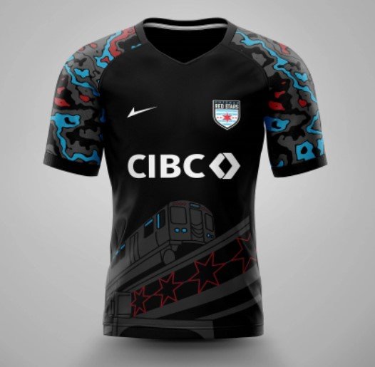
11. Red Stars Dark
The fact that this atrocity ranks above even a downgraded light kit is mind-boggling to me.
There was a hilarious disparity in the comments.
Phuoc-I love this! It feels like a comic they put on a kit. Chicago should be proud as they continually put out amazing designs.
Laura-I truly do enjoy it when parts of the city are included in the jersey as the Red Stars did. Love the colors that pop in the sleeves, love it!
Bri-I wanna like it, but it looks like my sleeves have a bacterial disease.
Bekki-Words cannot describe how much I hate this jersey. It looks like a pajama top for a 4-year-old. I get the train is a city-specific ode but it's too cartoony. And what's with the weird hyped up camo arms? Too much is happening and none of it ties together.
Zach-The camo doesn't relate to the theme at all, the train at the bottom is so subtle I went literally a half a season without noticing it was there. One of the lamer entries in the black home kit trend.
Bryant and Me-A supporter-designed hit is always fun, but there’s just too much happening here. The train screams Chicago but not sure what’s on the sleeves.
Bryant and Me then invited you to @ then on Twitter, so fire away @BryantandMe.
10, Current Dark
Long-time NWSL fans tell me that they are sick of red kits due to the propensity of them in seasons past. Red is a difficult color to get right in my opinion. Too dark looks maroon, and this shade of the Current jersey leans toward orange just a bit much for my tastes. (Laura also said, “I like the orange”.) Teal is always a welcome color and in a rosier future I am sure we will get a teal themed kit. Most of the other comments were complimentary but agreed with me in that a teal jersey is the way to go.
9. Courage Dark
Gradient jerseys can be really polarizing. In fact, one respondent ranked this kit dead last. It wasn’t me, because I had this one my top 5. Other than the next jersey on the list, this one has the highest standard deviation in its ranking.
Zach-One of the better Home kits in the league. Simple design but pulled off really well. The pattern and color of the dots up top gives it an almost pearlescent look from far away that I really dig.
Bekki-If you're going to do simple, using a gradient pattern is a smart way to stand out. Of the more solid jerseys, I think it's one of the best.
Melina-I will always be a fan of jerseys with transition of colors like this one.
Laura-Not my cup of tea, the color looks mushed together and not in a good way.
Phuoc-Their jerseys every year just underwhelm.
The Polarizer
8. Racing Dark
Even after removing Bekki’s, Zach’s and my bias, this kit still had 3 top four rankings from the other 8 respondents. You can read my prelude to get a better sense of why I think this one will stand the test of time. This kit had the highest standard deviation in rankings. I will give you a taste of the comments:
Laura-Loving the vibes and that Racing went out of the normal and added some spice to the jersey.
Brianna-A nice Hawaiian vibe, but the sponsor logo is HIDEOUS.
*Redacted-It still looks to me like a pattern on a grandmother's couch to me. The pattern should have been broken up with solid dark rectangles around the number and name on the back.
Bekki-I was not in love with it when I first saw it but after seeing players on the pitch, it's so bold and obvious it's Racing playing. It's become so iconic of the team itself and I've grown to love it. The symbolism is great, the boldness is great. I love how unique and divisive it is.
Zach-I mean, hands down my favorite kit in the league even removing home team bias. It manages to pull of the rare feat of being full of nice, subtle touches that you can really appreciate in person up close while still looking good from far away and on TV.
I still think it would be better on a different color base. I had it at 2.
My Favorite Kit
7. Reign Light
The simple fact that a kit is white doesn’t disqualify it from being great. Lyon have had come wonderful kits in this color scheme over the year. I am surely biased by the fact I think the French teams have some great kits and that this kit has a familiarity to it. I love the idea of putting the names of past players on the kit in an unobtrusive way. I like the gold swoosh. I love that the sleeve caps are different colors. The sponsor logo is nicely integrated too and doesn’t give me PTSD like Racing’s “GE Appliances” logo (I worked for a supplier of GE for a brief period). Most everyone else likes it too(especially the names), just not as much as I do.
The “Not Quite” Kit
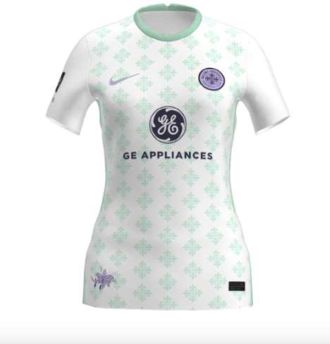
6. Racing Light
For the pedants…I probably shouldn’t interchange kit, jersey and shirt. I apologize for that. A true “kit” includes a shirt, shorts, socks, boots, and shin pads. The first three of those are dictated by the team and boots and shin pads are left to the players whims. Taken as a jersey/shirt alone, this ranking is probably too high. It is probably about right when taking into account what have to be the best shorts in the league. I didn’t instruct the respondents on how to judge the word “kit”, and if this was scientific, I would have included instructions and made sure all of the photos would have included shorts (you are seeing the photos that I included in the survey). That left it up to the respondent whether to consider the shorts. It probably only really mattered on this kit anyway.
While the mint on the jersey doesn’t really come across on TV, the shorts do. For that reason, I ranked this kit personally at 9. Others liked it much better.
Laura-I know that there are limitations with the white jersey and Racing tried to deliver the idea of the mint color. It feels like it's almost there, but it was held back due to NWSL norms.
Susie-Like many, I was hoping Racing Louisville would go full mint. Alas, the league's requirements make that difficult. This is another jersey that I didn't like when I saw the photo. Having a chance to see these on TV and in person, and paired with the mint shorts, I really dig this look. I just really wish the socks were mint too.
Zach-It's fine. I think similar to the ACFC dark kit it's a solid design that is just a little too subtle from far away on TV. Very glad to see some mint green this year and the Lily at the bottom left is a nice touch. Not bad but definitely some room for improvement in the future.
Bekki-I'm glad Racing stuck with the Racing specific pattern. It would get much lower marks for me if it was just a fleur-de-lis symbol or something. I wish there was more mint, but I'm glad there are flourishes like the lily and the purple swoosh to provide more contrast.
The Overrated 4
5. Current Light
I think I like this kit less each time I look at it. I just don’t think there is anything that interesting about it. I had it ranked at 7, but I can’t for the life of me remember why. Bekki and Zach really liked it for some reason. Only 2 respondents had it ranked in the top 5, but nobody hated it, so it beat out less polarizing kits.
4. Gotham Dark
This one was another head-scratcher for me. I had it firmly in the middle of the pack at 11, but 5 respondents had it in their top 5. Let’s hear from them.
Laura-I love these colors together so maybe that's why I already have some liking for this jersey. It's a classic sash jersey.
Susie-I know this is a really simple design, but I think a sash can work well with the right colors. Gotham accomplished that with their dark kits. The light blue on top of the black pops.
Ryan-Great, classic looking jersey.
Bekki-It's simple and classic. I'm not as wild about it as some are, but I like it and appreciate how clean it is.
Bryant and Me-Goodness, a sash on a kit is a thing of beauty when done correctly. Gotham FC did this correctly. The light sash on the black kit is perfect, and like the dark Dash kit, should not change.
To be completely transparent, I hate black jerseys in general, but the genral public seems to like them which leads us to…
3. ACFC Dark
2. ACFC Light
In old-time Hollywood style, Angel City has at least embraced the villain role and put themselves in black. Personally, I don’t think either of these jerseys is great. I simply don’t like black as a jersey color. In some lights, the dark kit for Angel City almost looks midnight blue, which is marginally better, I guess. Let’s hear from the people who actually like these jerseys.
Dark:
Bryant and Me-The ACFC dark kit is beautiful and the best kit in the league. Although wearing black and playing in the summer in LA might be the worst move LA had made. (Editor’s note: this is true for thin black material like jerseys. Thick black clothing actually keeps heat away from the skin.)
Phuoc-Simple and Elegant at the same time.
Ryan-Nice, subtle pattern.
Bekki-I like it. I think going with the art nouveau pattern was a great choice, but I think the pattern is too hard to see on the pitch. That said, it's very wearable.
Susie-I really like the intention behind this jersey design. The art deco is a perfect style for Los Angeles, and it is done in a subtle way that looks great on TV and in person. My only complaint is that I wish the club leaned into the "sol rosa" color more to contrast with the black.
The light jersey has been rumored to have elicited a fine from the NWSL. It is probably because of the amount of pink and black on the kit. Personally, I think the palm leaves look like feathers, but I guess that’s just me.
Light:
Laura-I am in love! It has that Cali feel. I legit feel like I could wear this to the beach somewhere maybe even surf in it.
Susie-I was surprised, honestly, that this rose to the top for me. That probably wouldn't have been the case if I hadn't seen the team play in these jerseys both in person and on TV. I don't naturally gravitate toward white jerseys, but this one incorporated a lot of color and leaned into the "sol rosa" color. They look even better in a match environment. Like Angel City's dark jerseys, I like that this feels like an LA jersey.
Zach-Hands down best away kit in the league.
Bryant and Me: The ACFC light kit is what happens when an expansion team has a lot of time to get their stuff together. The palm leaves make their light kit both a dark and light kit (Editor’s Note: maybe that’s the reason for the rumored fine) and the pink pops.
The Clear Winner
Pride Dark
I was really pleased that there was a clear winner. Not a single person had this kit lower than number four. It is not a new kit for this year, but it is the winner of these rankings. It might benefit from being somewhat familiar from last year, but it still is a very, very good kit. My only complaint is that I don’t think it is a great kit, and maybe there just aren’t any great kits in this league due to the restrictions. Within the restrictions, it’s an absolute winner. Let’s hear from the respondents:
Laura-My second fav, I love how the colors blend into each other without dividing the jersey. Plus, I love the touches of "stars" on the jersey and my fav color is purple!
Gary-Orlando has fire kits.
Brianna-QUE MAGNIFIQUE!
Phuoc-Love this!!!!! One of my favorites by far.
Ryan-Great jersey, but the black's gotta be hot in the Orlando Sun. They've totally embraced the space theme on both kits, and it works.
Melina-Not a fan at first but it really grew on me. I love the combination of purple and black.
Bekki-Love it. There are things to nitpick, but I think it's frankly awesome. I love the stars on the top and the pattern as it drops into purple. A+
Zach-Just a really good overall design. Checks off all the boxes, unique, incorporates local themes, reads well from distance. One of the better of the recent trend of black home kits.
Conclusion
I really had a good time doing this, but it was quite a bit of work. I hope that it keeps the kit discussion going and that one day the restrictions will be removed from the NWSL kit rules. I am open to doing this again next year, but I guess that will depend on the response. Again, I would like to thank all of those who participated and thank you for reading this rather long piece.
