A Hater's Guide to NWSL 2023 Kits

UPDATED 3/24/2023 TO INCLUDE KANSAS CITY
As Super Hans says…

People will bend over backwards to accept mediocrity. This year's new kits are a case in point. None of these kits hold a candle to some of the excellent kits being produced by the USL W League. However, this post isn't for the fans who like the new kits. This post is for the vast majority of people who hate one, most, or all of the new 2023 NWSL kits.
Zach Allen-Kelly was nice enough (mean enough?) to add his comments. His additions will be labeled ZAK.

Kansas City
The shorts and socks are nice, but people don’t buy those, so the fans are basically left with another boring white kit. Minus the logo and the badge, it’s virtually identical to the new Courage kit. In a fair world, those two teams would be forced to play each other in these terrible jerseys both times and somehow both come away with zero points. In addition, the Current should be given a 20-point deduction in the table for trying to sell this as the “ice kit”. Their fans of course love it for some reason.
ZAK: I feel like we've forgotten that THE WHOLE PURPOSE OF KITS IS TO TELL THE TEAMS APART.
What this says about you if this is your favorite kit: You don’t deserve nice things and luckily for the rest of us, you will probably never get them.

Louisville
Patterned kits are always divisive, so this really isn't what this fractured fanbase needs (not insignificant sections of fans continually give the front office a pass on just about anything and everything). Just do an all lavender jersey already! After picking an inaugural home kit that had flowers and bugs on it, Louisville decided to go with houndstooth next, so elitism abounds. My cursory search didn't really yield much in the way of houndstooth being used for sports jerseys (Secretariat aside), so this kit is potentially a first. However, everybody’s least favorite college football team Alabama likes to sell houndstooth merchandise to honor Paul Bryant. That man won a lot of football games, but also ran a camp where he withheld water from his players. Bryant and coaches like him are one of the reasons the coaching profession is still full of egotistical abusers. Alabama also tried to trademark houndstooth merchandise even though it was invented a few thousand years before the state of Alabama was. Louisville would like to mimic the winning Alabama has experienced and is already pretty adept at the whitewashing aspects of it, so why not pick a houndstooth kit?
Also, why is the badge mint? It's either a try-hard detail or a goofy decision. Regardless, it just seems odd to have a badge change color to NOT match the jersey. Still, it's a good kit for the NWSL, but anything that isn't either solid black or solid white would be. Congratulations, you tapped in a 6 inch putt.
The big question is will I buy it?
I'm the jerk who last year swore not to buy the new kit, but obviously I will. It’s slightly aristocratic in its design, so it will fit nicely into my rotation of Lacoste shirts and Arsenal gear. Then they also released this gem. I hate giving these people money, but I also have expensive season tickets so I will do it anyway because I'm the worst. I hate Soccer Holdings LLC but I hate myself even more evidently (not really, I really am more like Terrell Owens).
What this says about you if this is your favorite kit: You insufferably correct people’s pronunciation and ask them where they attended high school.

Portland
Nike is in the backyard of Portland, so this is a perfect chance to remind you that Nike is the perfect kit supplier for the NWSL as it too does the bare minimum to improve on its history of human rights abuses.
In a league that actually cared about having quality kits, this one would surely be in the either love it or hate it category. It's definitely unique and nobody can fault Portland for trying something different. In this league it's a top tier kit. But holy hell is it goofy. It's a way too easy target for Ed Hardy and tattoo jokes. It's definitely a little preoccupied with death and pain. There's the main quote, the Romeo and Juliette reference, the DAGGER, and the tiny drop of blood. It's trying hard to be hard. In reality, wearing it would definitely make you look like a less threatening soccer hooligan as opposed to more threatening one. Kudos for the dark shorts, but did they have to pick one of the ugliest colors possible.
ZAK: I will add that there is a pretty big difference between the “Authentic” shorts and the “replica” shorts.

Also, this kit is screaming for “THORN LIFE” across that empty patch on the stomach. Missed opportunity.
What this says about you if this is your favorite kit:
You have a tattoo that you never show in public and a fake nose ring.


Washington
The theme of these kit is "screw you". On original examination you might see this as the Spirit giving a middle finger to the league by saying the restrictions on kits are so bad, that we aren't even going to try. Upon closer examination, that middle finger is intended for a much broader audience. The audacious Thorns kit is priced at $110 in its replica form (a stupid $195 in authentic form) so imagine my surprise when I saw that both the black and white versions of the Spirit kits are priced at $120. That is basically begging any rational person not to buy it and extorting money from any irrationally fan who does. This kit is the most boring kit and doesn't even try to disguise it. I guess I would kind of respect that, except the team has never had good kits.
ZAK: BuT tHe CrEsT iS sHiNy.
What this says about you if this is your favorite kit:
You hate yourself so much you don't understand that you deserve better.
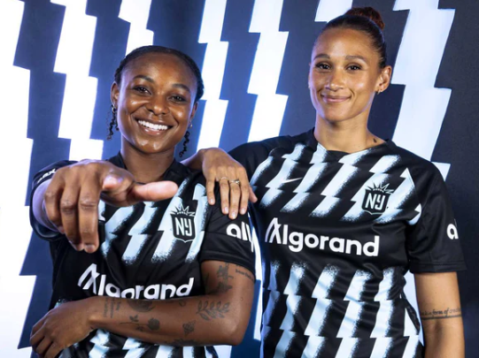
Gotham
It's another in a long line of black, navy, or dark purple kits for this league, but you have to say that 1) it's an upgrade over last year, 2) it's consistent with the brand, and 3) it's sort of interesting. On the other hand, would it have been too much to ask for a reverse of the blue and black colors? I get why they stuck with diagonal (but broken and fuzzy?) stripes, but vertical would have been better in my opinion. This would be a middle of the pack kit in a more colorful landscape, but in this one it rises to the top with a bar set very, very low. Not hateful enough...the people that live in the state where this team plays its home games (that nobody attends) are evidently not smart enough to pump their own gas (ditto for Oregon excluding the parts that want to become part of Super Idaho, or “Greater Idaho” as the movement would call it. It’s hard to imagine any addition to Idaho making it worse).
What this says about you if this is your favorite kit:
Somehow you're the "smart one" in your friend group, but your friends are really, really stupid.

Chicago
Sticking with the black base kits, this one from the Red Stars is another one in a worrying longer line of downgrades over what their past kits have been. There is no reason for this kit to be black. It's better than the stupid camouflage/L train kit, but being worse than that one would be nearly impossible. The Red Stars once had great light blue kits and their away kits actually make the white work (usually). Now, like everyone else they seem to be obsessed with black kits. Black kits are almost always boring. The grey background pattern won't read unless you're right on top of it. There's a reason it was launched with the player's wearing street clothes...the jersey by itself is dull as mud.
ZAK: STOP. DOING. BLACK. HOME. KITS. IF. ONE. OF. YOUR. TEAM. COLORS. ISN’T. BLACK.
Light blue, white, and red is such a dope color combo. USE IT!
What this says about you if this is your favorite kit:
You see your "Goth" phase as the peak version of yourself but everyone else who knows you prefers literally any other variation.
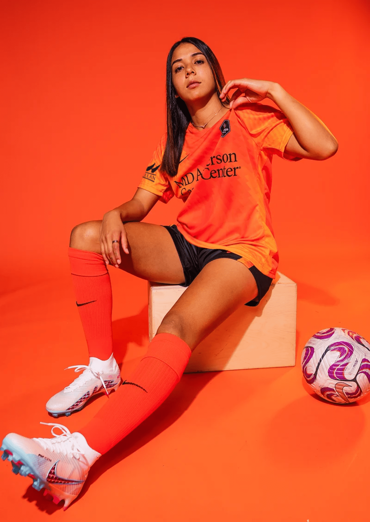
Houston
Breaking up the monotony of the parade of black and white kits is Houston's retina scorching La Estrella kit. You have to hand it to the Dash. They are predictably defiant in their choice to stick with the orange jerseys. (Sidenote: I am one of those annoying people who likes to remind you that orange the color is named after the fruit. I really am an insufferable know-it-all sometimes.) Once again, the details won't read on TV, so this is a jersey that invites people into your personal space to get the full effect. I actually wouldn't mind this kit so much but there is absolutely no desire for this club to try to work in a secondary color. Once upon a time they did, and those kits were much cooler. The Dash's home kits, like the Red Stars' kits are on a downward spiral. I expect this to ultimately end in the team coming out matching Otto the Orange costumes in 2025.
ZAK: The Dash consistently do the bare minimum of “has team color, makes home kit team color” which in the NWSL is good enough to be near the top of the kit rankings.
What this says about you if this is your favorite kit:
You get dressed in the dark and almost never do your laundry.

San Diego
Ever the Robin to LA’s Batman in the SoCal consciousness, San Diego fumbles any opportunity to outdo its neighbors to the north. The club has an excellent color scheme, but steadfastly refuses to use it in their kits. San Diego’s kits are screaming to eternally be a mix between hot pink and teal, but seem stuck in navy and white. It’s a safe choice that will never offend. It’s passionless, which probably explains why major league sports never seem to work in San Diego for long periods of time. The weather is too nice and there is too much other stuff to do. This kit is a warm-up plain and simple. I will be leading the riot next year if the Wave’s kits aren’t 200% better.
ZAK: YOU HAD TWO TRIES AND YOU DID A WARMUP BOTH TIMES.
What this says about you if this is your favorite kit:
You go the to the best Italian restaurant in town and order “buttered noodles”.

North Carolina
Another in long line of “the details won’t read” kits, this jersey looks like a fingerprint with sweater pills. The badge would have been cool 30 years ago, but now just looks like it purposefully tries to hide the team's name. This kit doesn’t deserve more than 3 sentences written about it.
What this says about you if this is your favorite kit:
You go to Baskin-Robbins and order fat free vanilla frozen yogurt even though you have a full gallon of it at home.

Orlando
The Pride made a minor update to their away kit, so it merited inclusion along with the new home kit.
HOME
Meh.
Could be better, could be worse. It's purple at least. It goes against the current trend by having less black in it. However, it is infinitely worse than the last home kit. It will look solid purple on the field and on TV, so once again the details won't translate.
ZAK: Hey, you can tell what team they are! Passing grade.
What this says about you if this is your favorite kit: You are slowly having all of the hope sucked out of your soul.

AWAY
Really more of a 1.5 update than a new kit, it merits inclusion because it continues the positive trend of moving to dark shorts and you can actually read the numbers this year. It still says “To the Moon” in the interior neckline, which for anyone over 45 probably brings to mind the threat of spousal abuse. I know I am starting to sound like a broken record (a dated reference that is now back in style), but the details are lost unless you are right next to it. The badge could add color but doesn’t. All in all, maybe Orlando is pulling Disney and making you pay twice for something that definitely isn’t’ worth it.
ZAK: So close to being really good if they had just made the design dark enough that you could see it from more than 6 inches away.
What this says about you if this is your favorite kit:
You join a gym every January thinking “this year will be different”, but you’re back to old habits in March.

Angel City
The home of blockbusters that nobody asked for once again brings you a kit that’s all sizzle and no steak. There’s a lot going on, and you can customize a patch:

However, that’s just to distract you from the fact that this kit is hot garbage. New Butchertown Rundown host Kaitlyn Whiteside says the kit reminds her of a water stain on her old Crosby, Stills, Nash, and Young album. I think the outline of LA is there to remind people where they are since nobody that can afford to sit in the good seats at the games is actually from LA. Los Angeles is full of people trying their best to pretend to be real human beings, so a kit that is trying to pretend it’s anything other than a nothing kit wit unnecessary details seems appropriate.
ZAK: No one outside of your city knows what your city looks like in silhouette on a map, even if you’re LA. I’m a geography nerd and even I would not have noticed that’s what the design was until I was told. 2022 ACFC away was my favorite kit last season so this is a pretty big downgrade.
Patches are great though, love patches.
What this says about you if this is your favorite kit:
You can’t understand how the cryptocurrency market crashed even though you never really understood how it worked in the first place.

OL Reign
The OL Reign calls this kit the “Purpose” kit and the purpose must be to give you vertigo. The disorienting mix of patterns on this jersey is there to distract you from the fact that this is definitely the most pretentious club in the league. Too full of themselves to represent a single city, this club would rather represent a club that doesn't have the greatest history when it comes to doing right by its female athletes. Credit where credit is due for being somewhat adventurous, but is two shades of blue really that adventurous?
ZAK: Please just be the Seattle Reign again. Remember this? Everyone loved this.

Have you ever tried to explain the OL thing to a casual fan at the stadium? It’s a nightmare. Your team name should not require a 5 minute VOX explainer video.
The kit’s fine but it does kinda look like someone tried to take a picture of a computer monitor with their phone.
What this says about you if this is your favorite kit:
You are fully secure in your identify and that identity is “irritating to the point of ridiculousness.”