Ranking the 2024 NWSL Kits
On the whole, the league did much better this year with kits. Although they stuck to a template for the the secondary kits, at least we got some color. Some of secondary kits work better than others (see below), but even if some of the primary kits were a little “try-hard” there are some really fine kits this season. However, it's good to know that Washington is still there to be the floor when it comes to rankings. I will rank the secondary kits, then the the primary kits. Let's dive in…
Secondary Kits
The one that doesn't work:
14. Washington Spirit
As far as I know, the Spirit don't have any history with the color yellow, so this gradient highlighter yellow to Post-it note yellow may be a nod to the jersey sponsor CVS as a place to purchase over-priced office supplies. Regardless, it's bloody awful and therfore true to Washington's form.
The ones that kinda work
13. Chicago Red Stars
I hate the badge and the blues are “greener” than they need to be. If they stuck to a single color I might have been on board.
12. North Carolina Courage
It's basically a color issue for me on this one. I am not crazy about either shade.
11. Bay FC
It isn't great by any means, but it beats a straight black kit. The inaugural season patch is cool and I think the badge works in orange.
10. Portland Thorns
It's their color choice, so you have to respect them for sticking to it. The badge seems like a downgrade.
9. Racing Louisville
It isn't especially bad or good, just rather anonymous. It looks like a warm-up. The gradient doesn't do it any harm, but doesn't add anything.
8. Orlando Pride
It really is quite similar to Racing’s secondary kit, but the colors just work better. The swoosh is nice on this one.
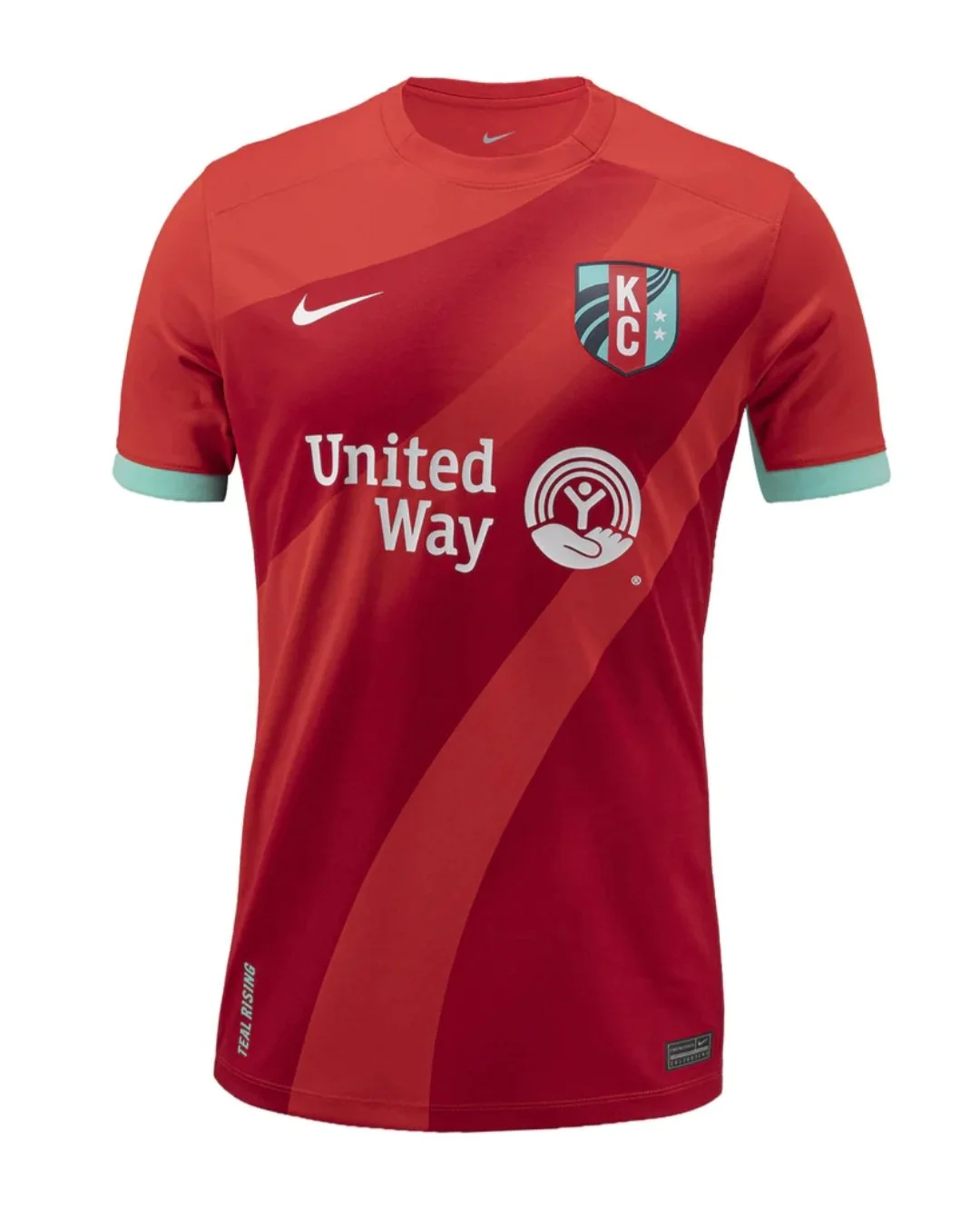
7. KC Current
This one comes close to working, but I feellike a teal to mint gradient would have been the way to go.
The ones that work
6. Houston Dash
This one is what the KC one should have been. It also gave Houston a chance to highlight the blue in their color scheme for once.
5. Angel City
It's fairly straightforward, but the different shades of light pink work together. The badge pops on this one.
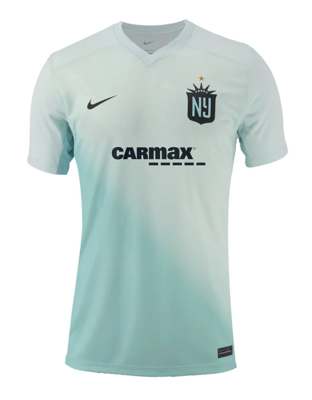
4. NJ/NY Gotham
The color scheme is fine, but the star on top of the Lady Liberty part of the badge really works on an understated kit like this.
3. Utah Royals
Even based on a template, this is a fine jersey. I am partial to the blue/yellow kit combination, so this one really works for me.
2. Seattle Reign
This one works mainly on the heavy lifting of the returning Reign badge. It has a simple but classic feel. As always, the jersey sponsor boosts the Reign kits.
1. San Diego Wave
To be completely honest, this jersey benefits because the previous Wave kits were so bland, but it is very pink and thank goodness for that (finally).
Primary Kits
Kits that are still too boring
14. Washington Spirit
The red, white and blue color combination is the most successful combination in the history of the world, so the Spirit decided to forgo that once again and stick to black and white. This kit is just stupid and pointless.
13. Bay FC
Bay is already stating it's intent to overtake the Spirit for most boring kits every season. This one is only redeemed by the patch.
12. Angel City
You're fooling nobody Angel City. This kit is just a lazy reworking of the previous ones and the effect on this one is worse.
11. Portland Thorns
If those triangles are supposed to represent thorns, then it is a very lazy attempt. I'm not sure what to call that shade of red other than boring. The badge is a downgrade.
The “Try Hards”
10. Orlando Pride
It isn't boring, but that is the only thing going for it. Houston should sue because orange belongs to them. The sleeves make it worse.
9. Chicago Red Stars
If this one just calmed itself down a bit, it could have worked. Picking a single pattern and applying it uniformly would have been a hit. This one is a real lost opportunity.
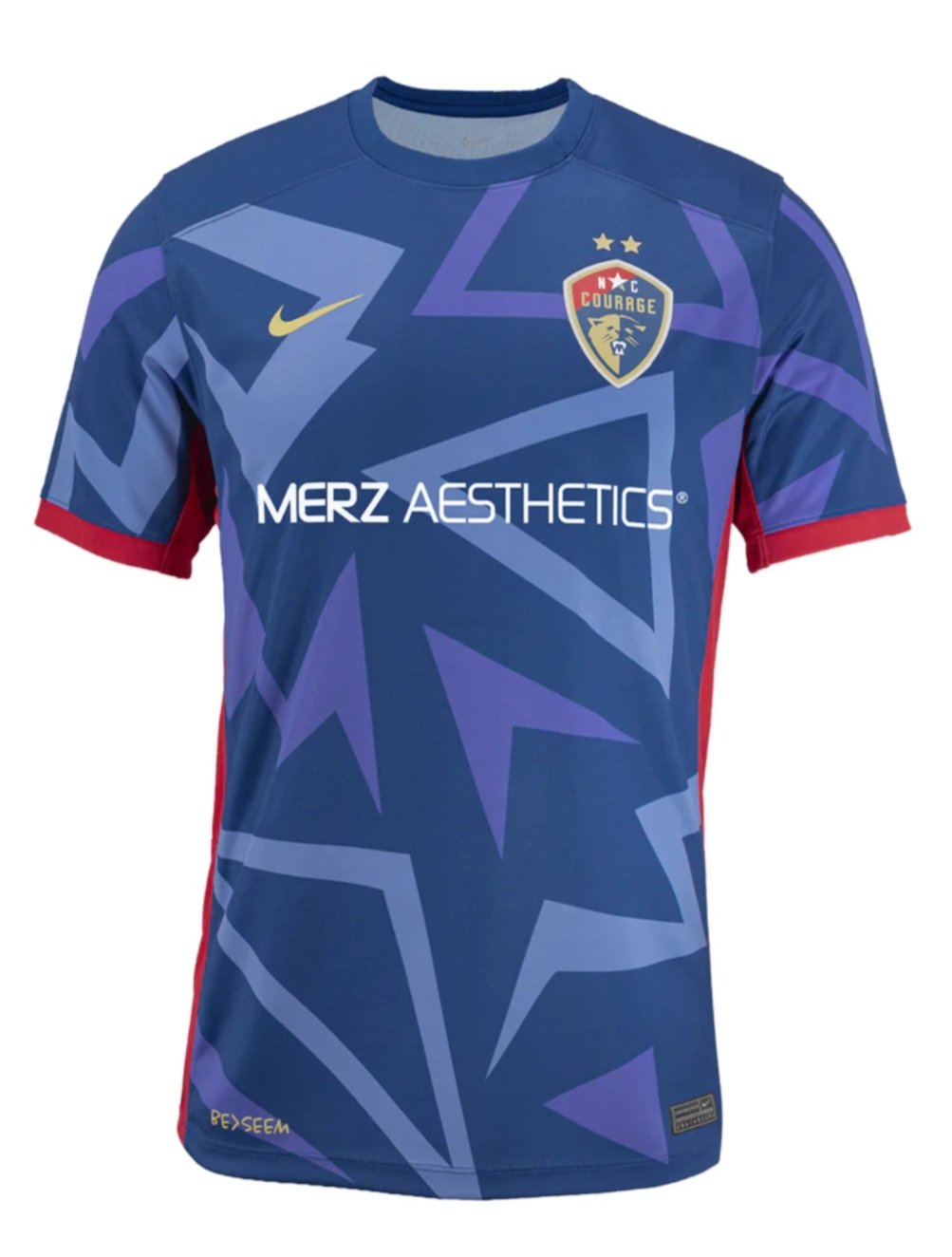
8. North Carolina Courage
There is simultaneously too much and nothing going on with this kit. If you strip off the shapes it is dull, but the shapes distract. It will be interesting to see how this one reads on the pitch.
7. Houston Dash
The black accents work, but the pattern seems pointless. It does have a little bit of an 80s Houston Astros jersey feel, but I love that jersey and don't love this one so I am blaming the pattern.
Not quite there but nice effort
6. Racing Louisville
It's already been said, but this is a sweater vest kit. If the pattern would have been applied to the whole shirt it might have worked. At least it's lavender so that's a plus. The argyle is nice. DAMN THOSE STUPID SLEEVES!
5. NJ/NY Gotham
Gotham is sticking with the sash. Sometimes it works. This time it doesn't quite do it for me. It's still better than half the league.
4. Utah Royals
You definitely see what Utah is trying to do with this jersey, and it almost works. You have “Royal” in your name so why not use royal blue? That seems like a no-brainer to me, but I always prefer royal blue to navy. The mountain motif is nice, but a little blue in the mountains might have been nice.
The great kits
3. Seattle Reign
Even though I just said that I prefer royal blue to navy, it works with the gold on this kit. It's simple without being boring. Look at that gorgeous badge! I will say it once again, “Welcome back!”
2. KC Current
This is how to work a patern! It connects with previous kits and the pattern feels “currenty” without hitting you over the head with it. The teal accents work and the United Way logo seems right at home. In other years this is the best kit, hands down.
The Beautiful One
1. San Diego Wave
It's perfect. No notes. I get what it's saying. It speaks to me. The first classic kit in league history.
